Exterior Render – SketchUp Podium & Photoshop

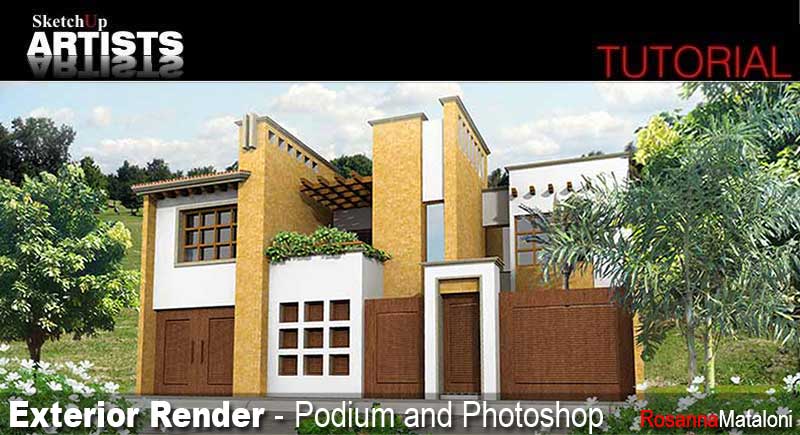
A nice little tutorial from Rosanna Mataloni, creator of the ever popular SketchUp Texture and an expert in fashion trends and style for many years. This updated tutorial covers Rosanna’s basic workflow including SketchUp Podium render and Photoshop post processing.
SketchUp Model
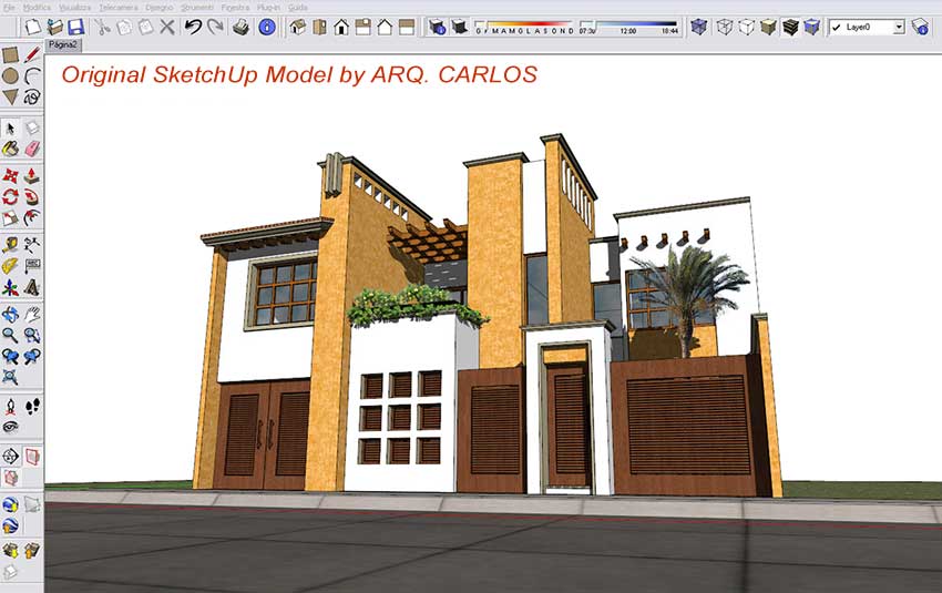
The textured SketchUp model used in this short tutorial is by ARQ. CARLOS and can be found here. It has some of the entourage elements removed from the original downloaded model as it wasn’t needed.
Render Settings
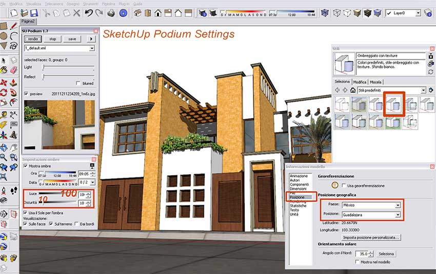
Render settings including Geo-location, Shadow settings (Light at 100 and Dark at 10) and Style selected is Shaded with Textures.
Render
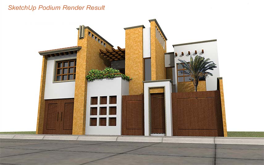
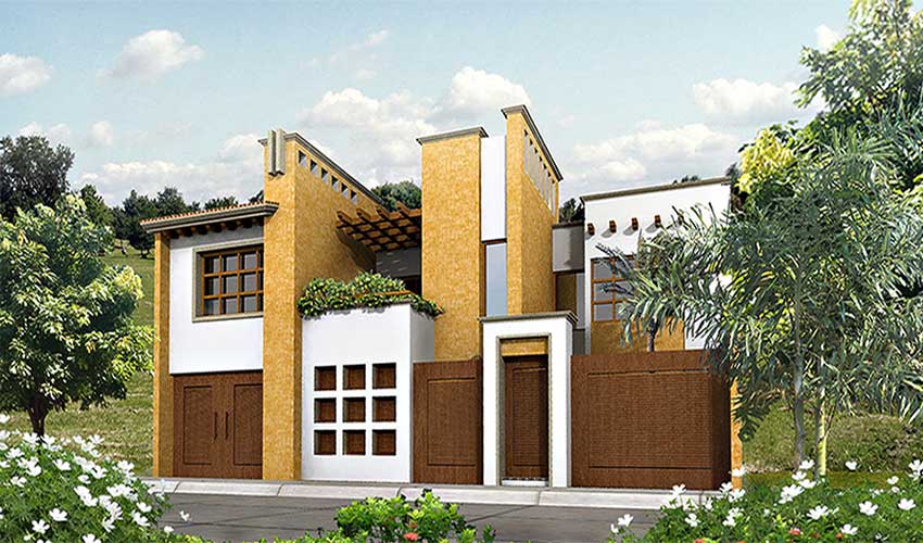
Sketchup Podium render result (You can download a free trial of SketchUp Podium here).
PhotoShop
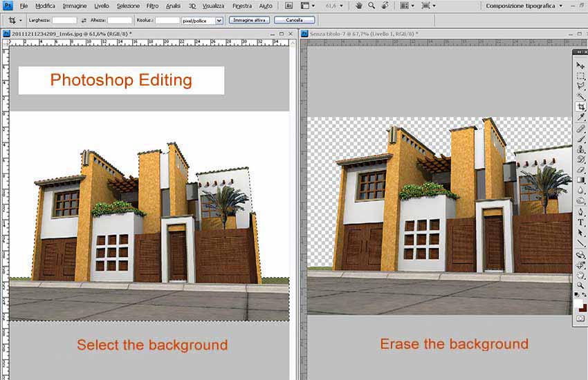
a. In Photoshop select the white background (Magic Wand Tool or Polygonal Lasso Tool) of the imported image and delete it. You can also select the background and then go to Select>Inverse and then copy and paste (or cut and paste) it. This method pastes the building onto a new layer without the background.
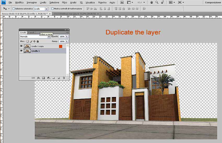
b. Duplicate this layer and call it the Building Layer.
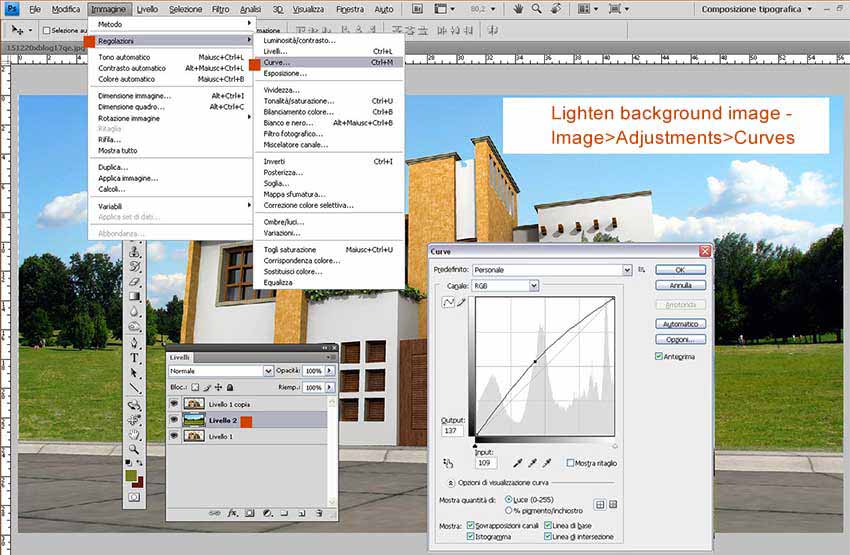
c. Open your chosen background image and copy and paste it into Building Layer so its behind the Building Layer. Name this new layer Sky Background Layer.
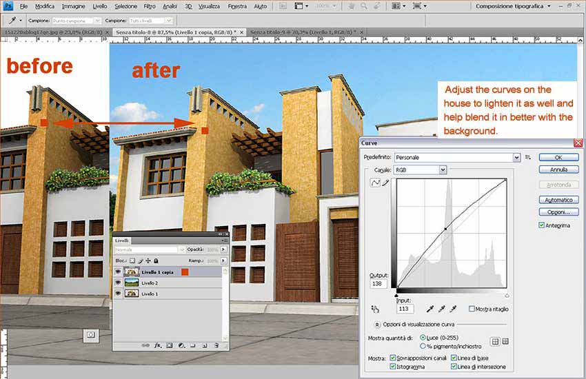
d. The sky background image in this particular case is a bit dark, so we will lighten it, so it blends better with the building in the forground. Select the Sky Background Layer and go to Image>Adjustments>Curves and lighten it by dragging the curve to the left slightly.
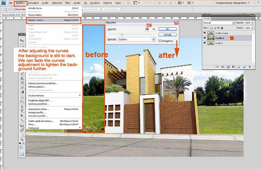
e. After adjusting the background image with curves, it still wasn’t quite right ( a little to dark still ) so I further lightened it by going to Edit>Fade Curves and then took the Opacity down to 29%.
f. Next the edges of the treeline were softened on the Sky Background Layer using the Blur Tool as they were too sharp looking.
g. Next select the Building Layer on top of the stack and do the same with the Curves. I lightened the building slightly to blend better with the background image.
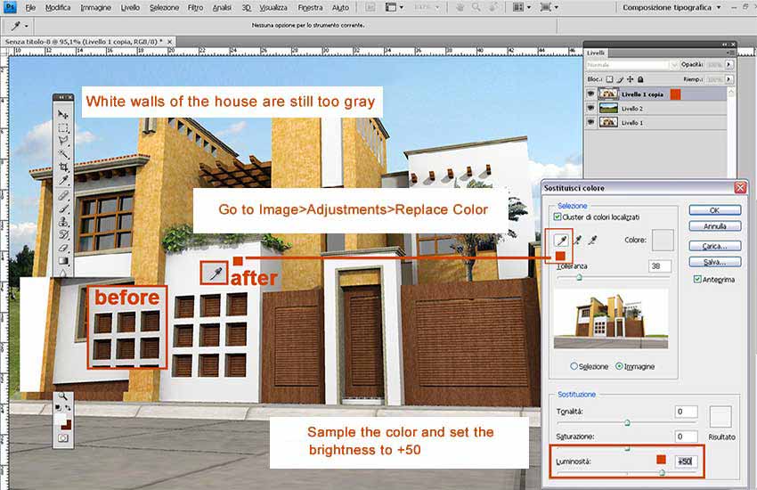
h. The walls of the house are just a little too grey. Lets sample the color and adjust them. With the top House Layer active go to Image>Adjustments>Replace Color and Fuzziness at 38 with Image selected. Sample the wall color with the Eyedropper Tool and set the Lightness to +50, then click OK. The wall color should lighten up nicely.
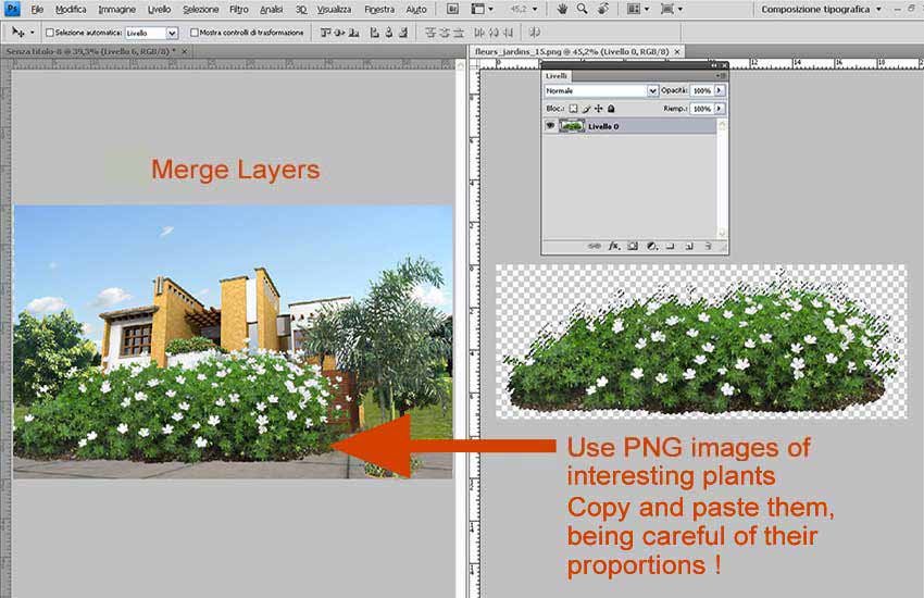
I. You can merge your two top layers if you wish and we can move on to adding some plants to the forground, scaling them to a suitable size.
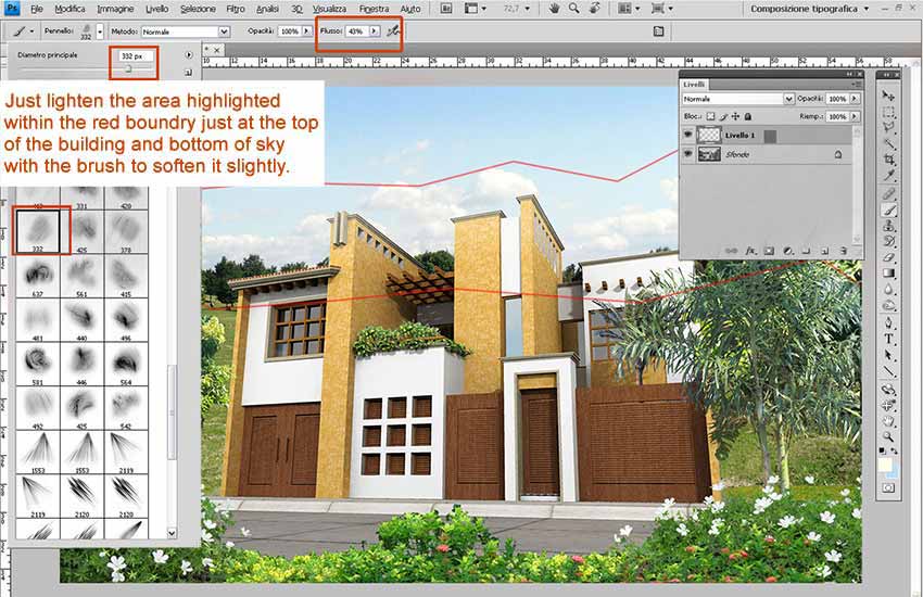
J. This step is not strictly necessary but I like to create a slight difference in sharpness between objects projecting upwards towards the sky and those projecting downwards to the ground, like reality. So I created a slight ‘light fog’ effect. To achieve this effect I created a new Layer. I then used brush No. 332 – color white, size 332 pixels and Flow 43% ( download brushes here ). I then gently add some touches of white at the top of the house within the red boundry.
Final Image
Thanks for reading and I hope this gave you some insight into my workflow and you will be able to take something away from it to use in some of your own vizualization projects.
Rosanna






i am deaf. i am working architect and interior designer for ten years. so please teach me ok
The perspective of the background is wrong, In the step c. the perspective is correct, but in the lasts frames is higher than the normal.
I dont know why you put a palm tree if you cover it with a png tree later.
A personal point: I dont like the flowes in the top layer, it gives a “infantil” aspect to the render. Anyway,s is a good start point for the new modelist.
pls. send me a tutorial video of scketchup
What an amazing work!, i’ve never seen such a qualitative work before.
welldone , you did it excellent .
thanks for shairing your skills.
nice work
plz plz plz
send me in my email render setting ideas how can i take good render for exterior n interior views
[…] Exterior Render – SketchUp Podium & Photoshop … – Exterior Render – SketchUp Podium & Photoshop. A nice little tutorial from Rosanna Mataloni, creator of the ever popular SketchUp Texture and an expert in fashion …… […]