The Making of 412 Broadway

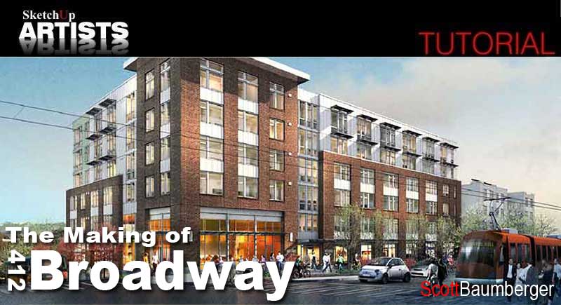
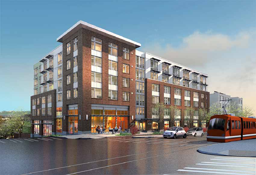
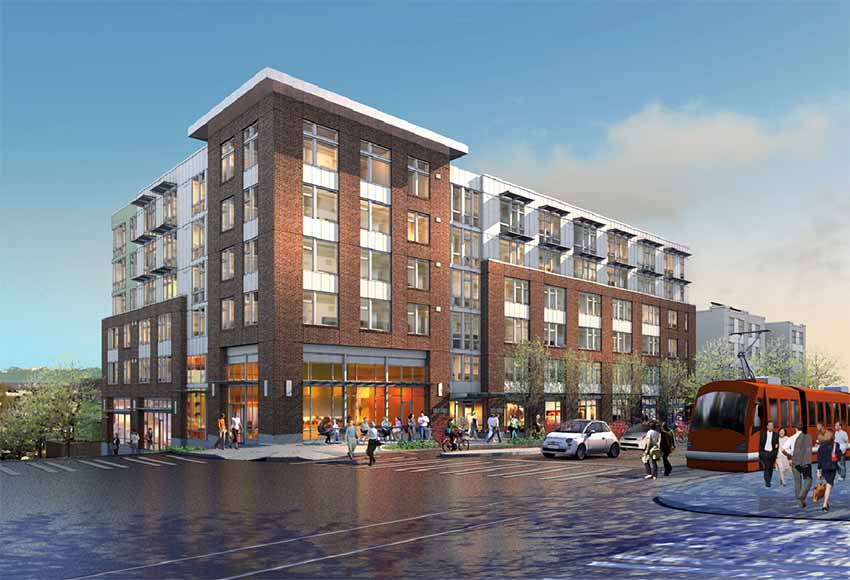
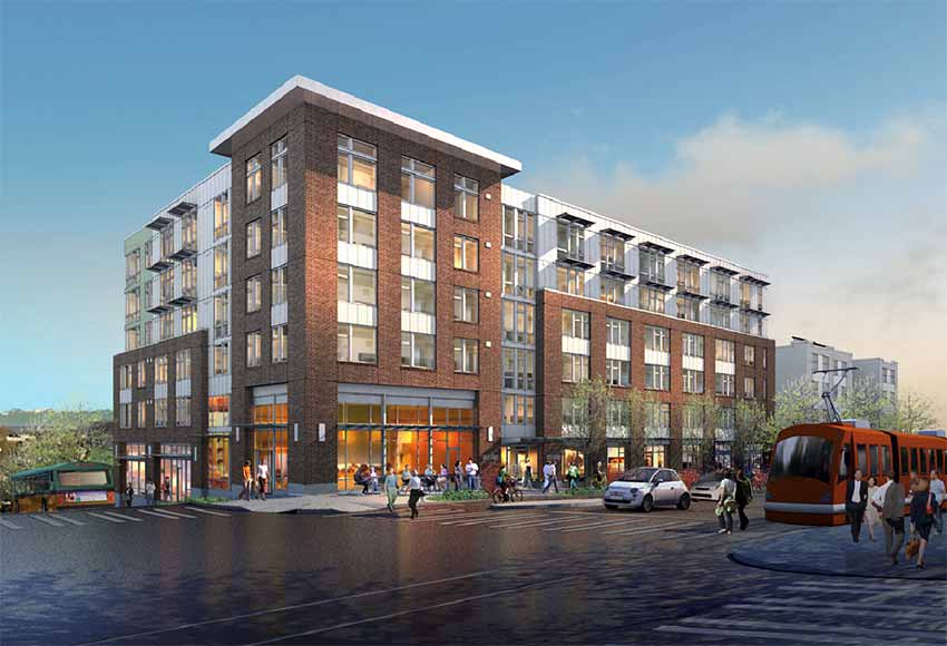
A very detailed article by Scott Baumberger in which he explains his workflow and technique in producing a really professional NPR (Non-photorealistic rendering) architectural visualization. Known as Barclay | Broadway (or 412 Broadway) it is located in the First Hill neighborhood of downtown Seattle directly adjacent to Seattle University. Barclay Broadway was developed as a highly sustainable mixed use apartment and retail project.
You will learn a lot from this latest ‘Making of’, including some nice little tricks to get some really excellent professional results. Most of the work is done in Photoshop and the model was provided by the client, so it was a fairly quick process. Scott says the SketchUp exporting and Shaderlight renders took only a few minutes and the whole process took about three days, which included waiting for client feedback. There is lots to see and learn here…so if your a NPR fan, get reading and enjoy!
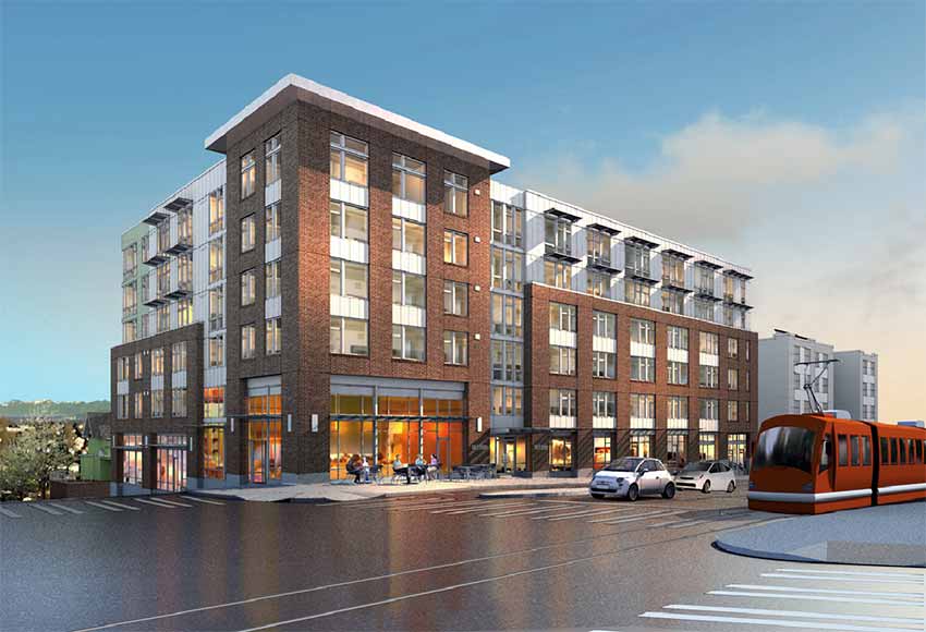
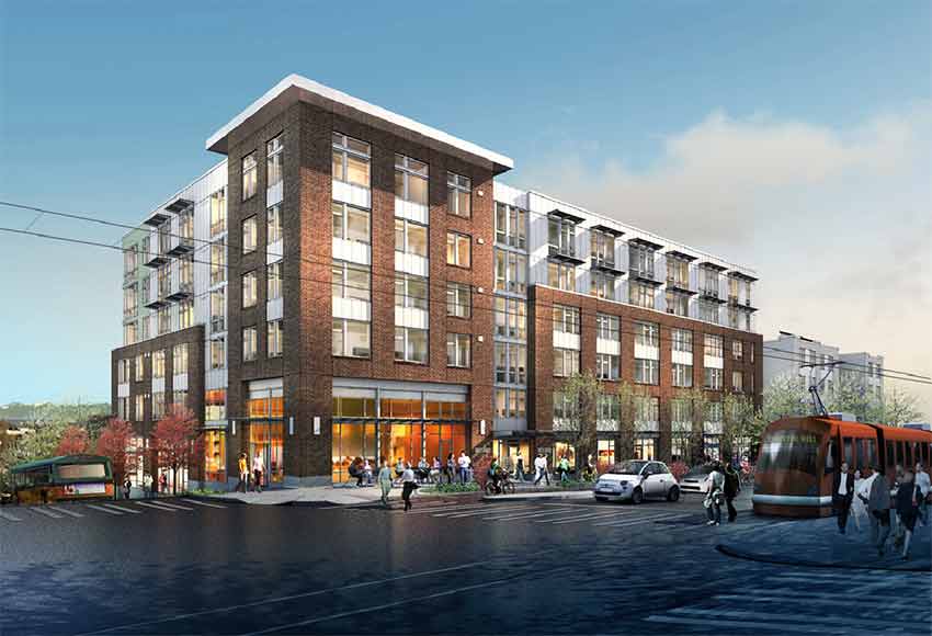
This rendering was commissioned for a multi-family project currently under construction in Seattle. We knew upfront that the viewpoint would be from the northwest, showing its corner site and relationship to Broadway and the new streetcar line. This eliminated the need to model the south and east sides of the building, greatly simplifying the modeling and viewpoint selection. Once the model was done, I sent a few viewpoint options to the client for review.
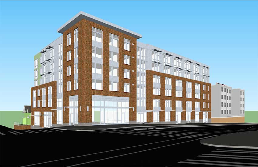
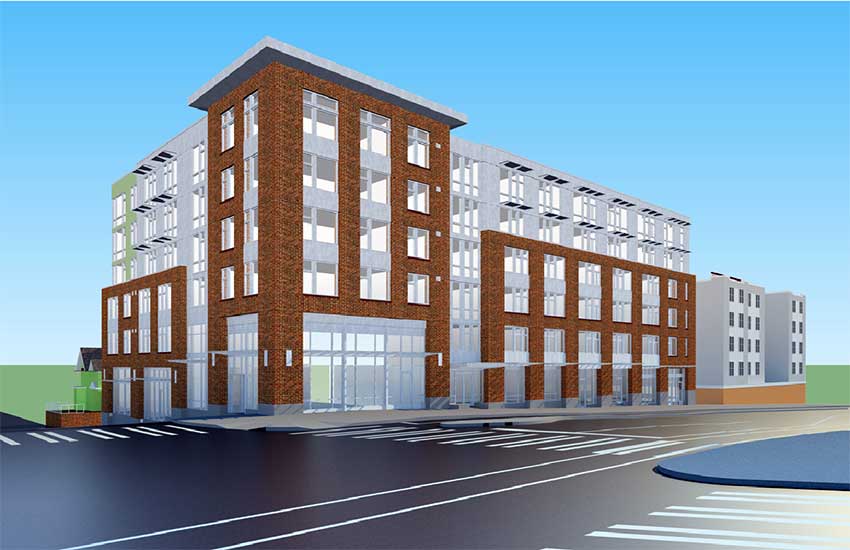
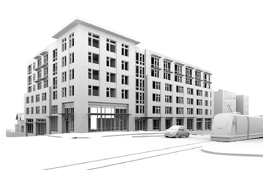
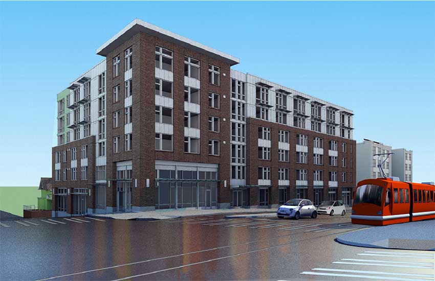
We picked the middle of the these three, a view that heavily favored the west elevation and downplayed the steep grade heading east. Of the three, it also did the best job of highlighting the residential entry and lobby. Once the viewpoint was approved I exported several image passes of the SketchUp model. I set the image size export in SketchUp at 4000 pixels wide ( File>Export>2D Graphic>Options) to make sure all exports match properly in Photoshop. This first one is set to “Shaded with textures” and edges are turned off.
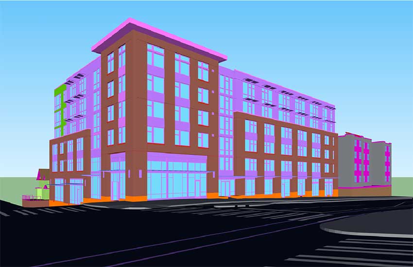
Another color pass is exported that will be used for selection sets. In the Styles menu, I go to “Edit” and the the “Modeling” tab and check the box next to “Color by Layer”. This assigns a single color to every surface on the same layer. I’ll create selections for brick, glass, and so on from this export.
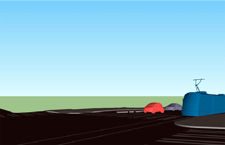
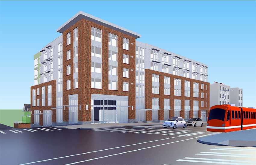
To keep the file sizes down I added the cars in a separate model. The only reason not to do this is if you want the cars to cast shadows on the building or if you need reflections of the building on the cars (or vice-versa) – in this case, I don’t need any of that so I saved a copy of the model and deleted the building but kept the ground plane. I then added a couple cars and a Seattle Streetcar model provided by the client. I then exported color passes as before from this model.
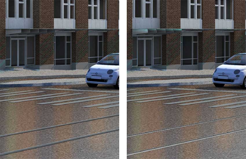
I did some experiments with the Shaderlight plugin for getting a render “beauty pass” but was never satisfied with the results. But the sheen in the asphalt material was feeling good so I rendered the building model but kept only the ground plane. Here is the render pass from Shaderlight composited with the raw color pass from Sketchup.
I then composited the color export of the cars model and added a new layer on top to fix some of the holes in the model – the glass at the corner cafe, the island in the street, etc. At this point the client requested that the second car be switched to a Toyota Prius, so I just set it on top of the old car – because it is on its own layer I can select its contents for masking later.
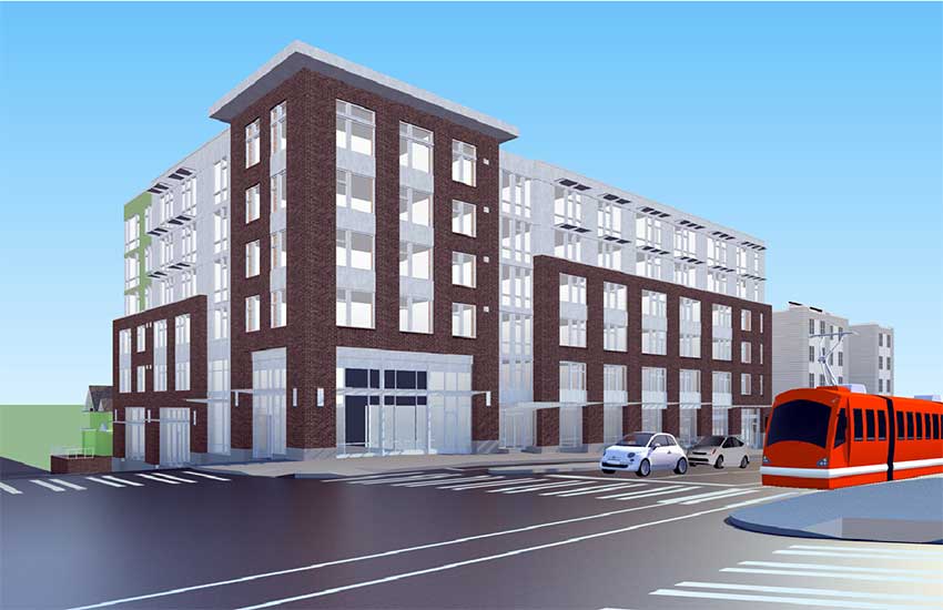
Next, I add a few adjustment layers to the brick and siding to match the color and tone of the provided samples. I also add faint horizontal lines indicating wood siding on the adjacent building to the right.
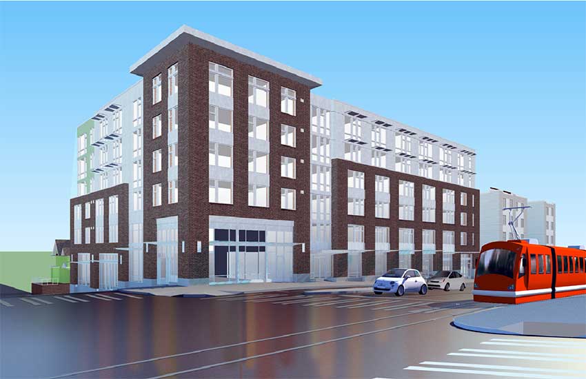
I then paint in colored reflections on the street – because there is so much pavement in the view, it seemed like it needed a bit more interest. I created a new layer group with a mask based on the selection set. Then I started painting with a hard round brush about 80 pixels wide to create the vertical streaks. Holding down the Shift key as you paint will keep the lines straight up and down. Change the layer’s blending mode to Soft Light and then use Gaussian Blur until it feels right.
At this point, I also added some reflections in the car & streetcar windows. Again, create a layer group with a mask to limit the area. I then pasted in a site photo and applied a heavy Motion Blur filter to get the right look. Change the blending mode to Screen in this case.
Now it’s time to adjust the shadowing. Using the selection set layer, I select all of the north / shade side faces of the model. On a new layer set to Overlay, I fill this area in with a medium blue color – just pick a blue from the sky via the eyedropper tool. If it’s too light or too dark you can always change it later via Hue/Saturation. This step simulates a typical “sky dome” lighting model without having to go through all of the steps necessary to fully render the model. At this point I also heighten the bluish-green cast of the light coming through the glass canopies.
To tighten things up a bit, I add an Ambient Occlusion (AO) pass. Using the Shaderlight plugin I render out a view at 4000 pixels with the same aspect as before with the Chalk Render mode. It usually takes some experimentation to get to the right settings, but it can always be adjusted later on in Photoshop if need be. Generally, I try to get a full range of grayscale value and a good “wash” effect on the larger surfaces. Here’s the AO pass in normal blending mode.
The AO wasn’t working well on the Prius, so I just turned it off in SketchUp. Here is the same image pasted on top of the layer stack in Photoshop with the blending mode set to Multiply.
The rails and the glass canopies are still a little drab, so I punch them up with some layer styles.
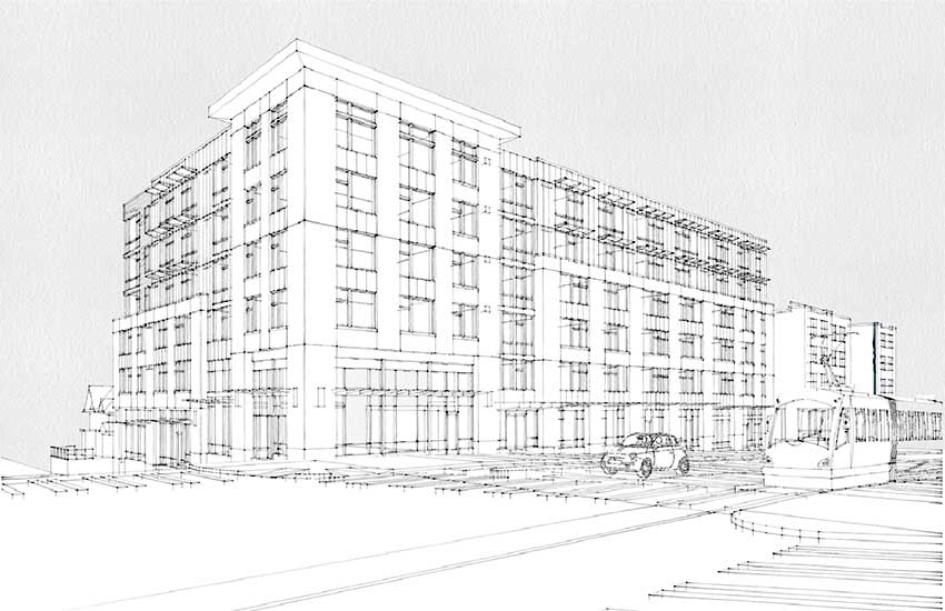
Now it’s time to add linework to soften up the image and give it a hand-drawn look. Using a custom style in SketchUp, I export a lines-only pass at 4000 pixels wide. Here it is in Normal blending mode.
The Prius didn’t hold up too well with the linework pass either, so I turned it off again for this export. As with the AO pass, I paste the lines-only layer on top of the stack and set the blending mode to Multiply. This layer really helps to define the joints in the brick and metal panels.
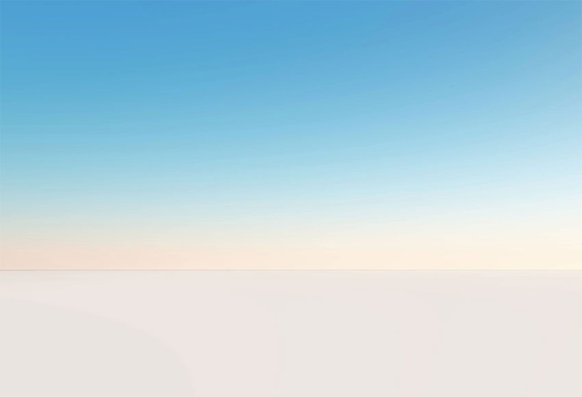
Now it’s time to start working on the background and the sky. I create a new group and mask it. I build up the sky with gradient and custom cloud brushes and then add filtered site photos to create the background. Here is the sky gradient alone.
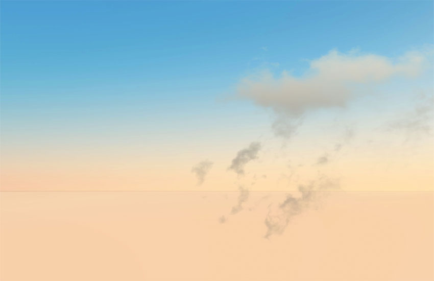
And now with more haze and some clouds.
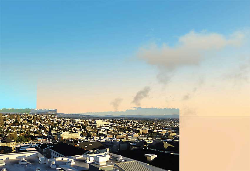
Sky and background image stitched together and filtered. I used a combination of the Median and Unsharp Mask filters to get the right effect. The client requested that the mountains in the distance be more green and the sky at the horizon to be more blue – I painted this in right on the photo with a hard round brush set to Color blending mode and Opacity at 20% until it seemed natural.
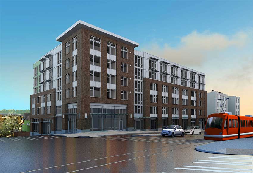
Here is the composited scene with a couple of trees placed on top of the backdrop but still within the sky group.
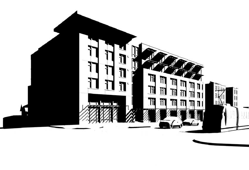
Now it’s time to turn on the sun! But before I do that, I need to isolate the areas of the model that are in shadow. To do this I export a shadows-only pass from Sketchup. Turn off edges and change the viewing mode to “Monochrome”. Open the exported file in Photoshop and adjust the levels so that it is black & white only.
Using the magic wand tool, I make sure “Contiguous” is unchecked and select all the white areas on this layer. I create a new layer group called “Glows” and use the white area selected as a mask. Delete the shadows-only layer since I’m done with it. On a new layer set to Color Dodge blending mode in the Glows group, I select a pale yellow color and start painting with a soft round brush at low opacity. With this technique, I slowly build up the areas that receive sunlight. What a difference!
At this point, the image is feeling too saturated so I add an adjustment layer on top of the stack to tone it down a bit.
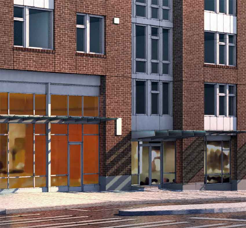
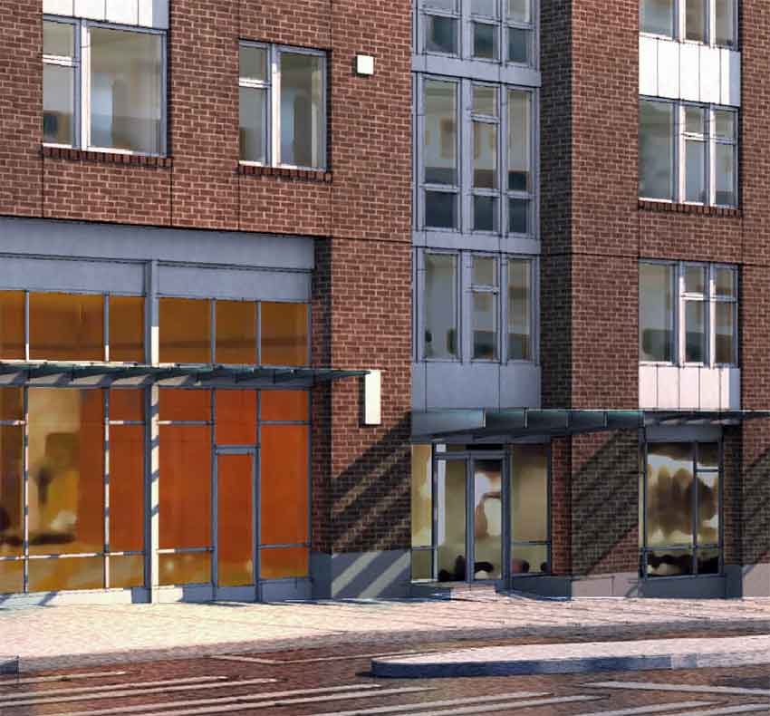
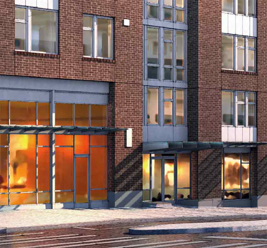
The next area to work on is the glass. I need to turn the lights on, but I also need to loosely indicate the interior spaces. With this in mind, I find photographic reference that matches the scale of these different spaces – the corner cafe is double-height so the lighting and perspective should match. It’s easier to see at a larger scale so I’ve zoomed into the entry area so the cafe, lobby, retail and apartment windows are visible.
Step 1 – a flat wash is added over the entire glass selection set. It’s a light blue set at 40% opacity. I add a layer style with Bevel/Emboss to simulate the panel thickness, a very subtle Inner Glow (set to Multiply blending) to simulate AO, and a Gradient Overlay (black to white set to Overlay blending) to indicate more light hitting the upper floors of the building.
Step 2 – Photos are pasted into the corner cafe and retail spaces. Blending mode is Normal, but the opacity is dropped down to about 50%. I then apply Smart Blur and Median filters to keep it loose. At this point, I’m just looking for variety and value changes and not any specific detail.
Step 3 – Same process with the apartments above. For these images, I look for interior elements such as picture frames, soffits, etc. that will reinforce the perspective and Skew / Distort them accordingly.
Step 4 – I add a glow layer set to Color Dodge blending mode at the top of the stack within the “Glass” group. Using a soft round brush at 20-30% opacity and a deep yellow-orange color, I build up brighter areas to simulate interior lighting. Then I go over it with a hard round brush to indicate the individual light sources. The ground floor should be much more vibrant and active than the residential floors.
Back outside I add cafe tables & chairs along the sidewalk at the corner.
Working back to front, I add trees and shrubs along the sidewalk as well. These are pasted into a new group that is masked by the cars / streetcar. I add a layer style to most of the trees with a Gradient Overlay (set to Overlay blending) and rotated to indicate the sunlight coming in from the upper right. With this technique, if you ever need to change the time of day, all you have to do is change the “Global Light” setting within the layer style and all of the trees will be updated.
Next, the people are added to the scene. I take care to arrange the figures to emphasize the entry and sidewalk activity. Since I’m still not happy with the Prius, I put a couple people right in front of it. I also set up a group at the far right to activate the foreground a bit.
Shadows on the ground are then added. My technique for this step is to create a new layer group with the same mask as the sunlight selection that was used earlier. Set the group blending mode to Multiply and leave the layers within the group as Normal – this will ensure that the overlapping shadows won’t be unnaturally dark. First I make a copy of one of the trees, scale it way up and then distort it to lay down on the ground plane. Using Hue/Saturation, I darken the entire layer to full black and then with the “Colorize” setting, bring back some brightness and give it a blueish-purple color. Make a couple copies of this layer and you quickly have a forest indicated off-screen. People shadows are handled the same way. Because they are in the same layer group, I don’t need to worry about them overlapping the trees.
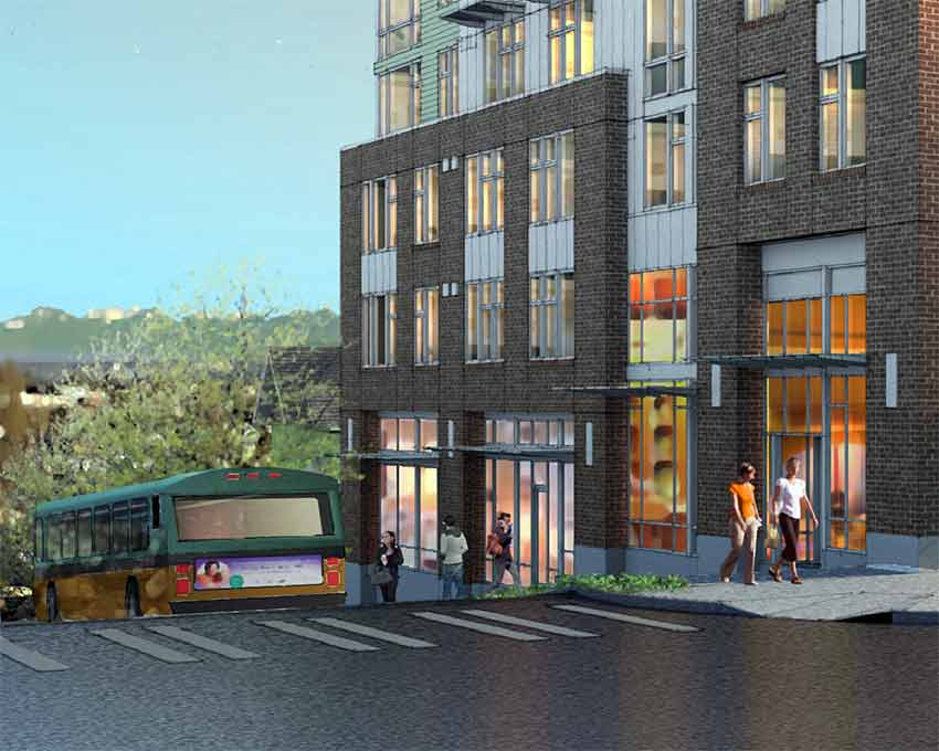
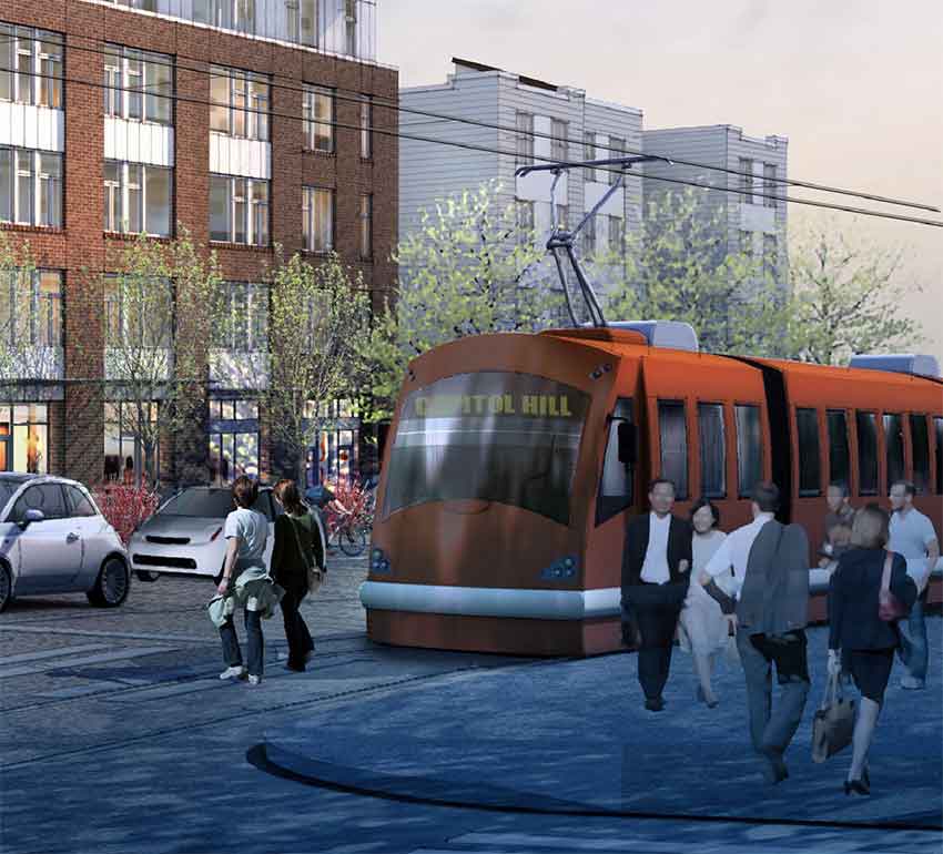
At this point, I get a client request to add a bus heading down the hill. There will be a bus stop at the northeast (far) corner, so they want to try to activate this part of the scene as well. Fortunately, I was able to find a bus model that was very similar to the Seattle model – I then pasted a couple photographs on top of the model in Photoshop. A little dodge and burn and it fits in pretty nicely.
Another detail at this point worth mentioning is the pair of women at the corner. In the stock image, the one on the left was wearing a bright red shirt – I toned this down significantly and slid the hue towards orange to pick up on some of the interior colors. This is a good practice to make sure the entourage isn’t distracting from the larger color / tonal moves in the image.
Now the scene is feeling pretty good, I start making final adjustments. First I add a few dark washes at the lower right to vignette the edge. This helps “ground” the image and maintain focus on the building.
More glows are added throughout the image to brighten up certain areas that are feeling too dark, particularly on the shade side of the building. I’ll watch the image histograms through this step to keep these areas from getting too bright.
Another client request was to add some red flowering trees on the north sidewalk. These are placed in between the glow layer and the bus group to ensure it is masked properly.
Another technique I use at this stage of the process is to create a dummy flat version of the image on top of the stack – use the Shift-Alt-Ctrl-E command to create this new layer. I flip it horizontally to check the composition. In this case the streetcar is still feeling too strong, so I experiment with a couple strategies of toning it down. The one that worked the best was a blue color wash over the lower right – this had the effect of dulling down the red-orange in the streetcar and some of the distracting elements in the foreground people group.
Another client request to add the route name to the streetcar. I think this actually helped it a lot – it was a bit of a struggle to have it read as luminous but not overpower that part of the image. Looking at it more closely, I also added a bit more shadow underneath the streetcar to help ground it. And of course, I went ahead and put in the overhead wires – small details like this can really help activate the whole rendering!
Final steps – at the top of the stack I experiment with some adjustments to see if anything “pops”. With this image, one trick that seemed to really help was adding a Black & White adjustment layer set to Overlay blending mode, dialed down to about 30%. This simulates the traditional photographic Bleach Bypass effect – toning down the saturation and increasing mid-ground contrast. It’s subtle, but definitely helping. I’ll zoom in at 100% and pan around to see if the adjustment is too strong / not strong enough.
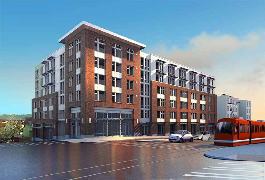
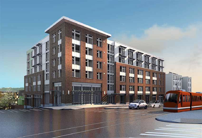
The last step is to simulate a paper texture over the entire image. I have an action that creates a couple new layers on top of the stack with custom paper scans set to Overlay. These scans have been cleaned up and adjusted so that the tonal range of the texture is centered at 50% brightness – this ensures that the texture won’t change the overall tonal balance of the image. I quickly experiment with the opacities until it feels right, both at the large scale and at 100%.
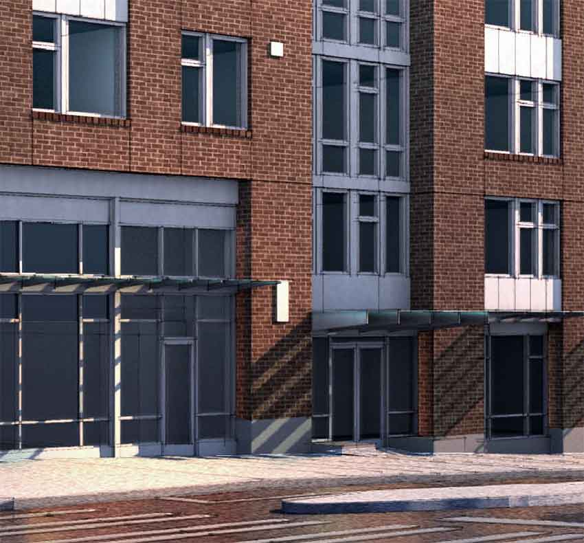
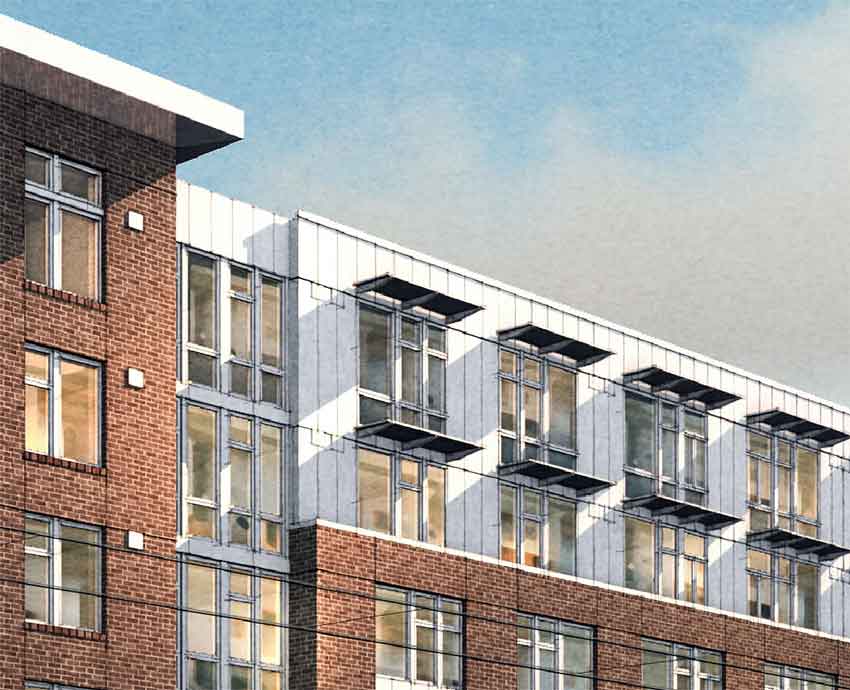
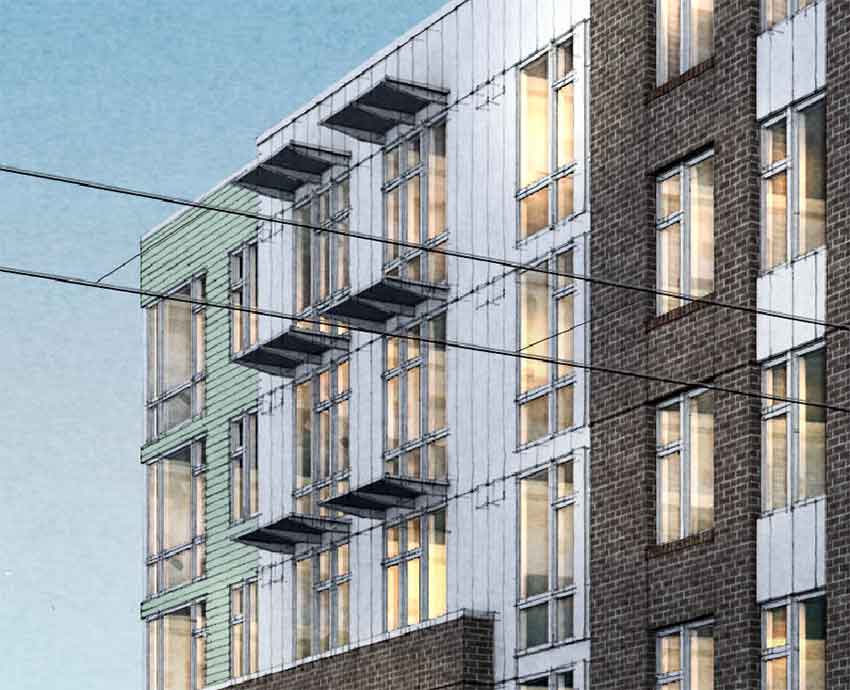
Here are a few more blowups to give you a feel for the image at full-scale.
Thanks for taking the time to read this article, I hope you will find it helpful to your work. Of course, feel free to contact me if you have any questions.
Scott








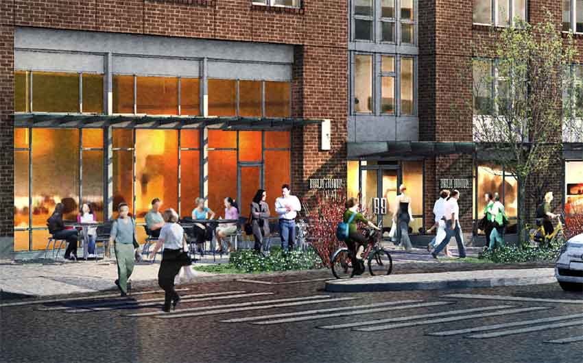








Oh i love this one. The style is between PR and NPR.. I was hoping it would be put and featured here and now its here.
Thnx Nomer we luv it too :))
Very helpful tutorial, especially in optimizing and conserving resources in rendering. Love it, thank you sir James.
Awesome work! Thank you so much for this most instructive tutorial, very helpful, indeed!
Great, detailed tutorial and awesome final product! The only thing I don’t like is the soffit of the overhang at the corner. There is something about the shading that looks strange… it’s as if the brick is being reflected off the soffit material.
great great stuff!!!
very cool looking technique!
thanks for sharing!
Paul
Great project!!!
[…] The Making of 412 Broadway :: SketchUp 3D Rendering Tutorials by SketchUpArtists. Share this:TwitterFacebookLike this:Like Loading… […]
Thanks!
was looking for a way to achieve npr with sketchup and photoshop!
hope to emulate it and achieve something like this.
cheers 😀