Quick Architectural Marker Illustrations

Christopher Polanski has yet to stop experimenting with drawing, rendering and modeling through the use of theoretical projects and problems. If there is one thing that he has learned about architecture, it is that it never ceases evolving and one is never done learning. Chris recently completed a contract job for a client that required him to compose a series of faux-marker renderings and has agreed to share his process with us.
This tutorial outlines a quick method for creating faux-marker architectural renderings using SketchUp, Kerkythea (or another rendering program) and Photoshop. While I use a Kerkythea rendering as my base image in this tutorial, note that it is possible to work through this technique by replacing the rendering with a textured SketchUp export with shadows on. I use Kerkythea here because of its ability to more realistically render shade and shadows.
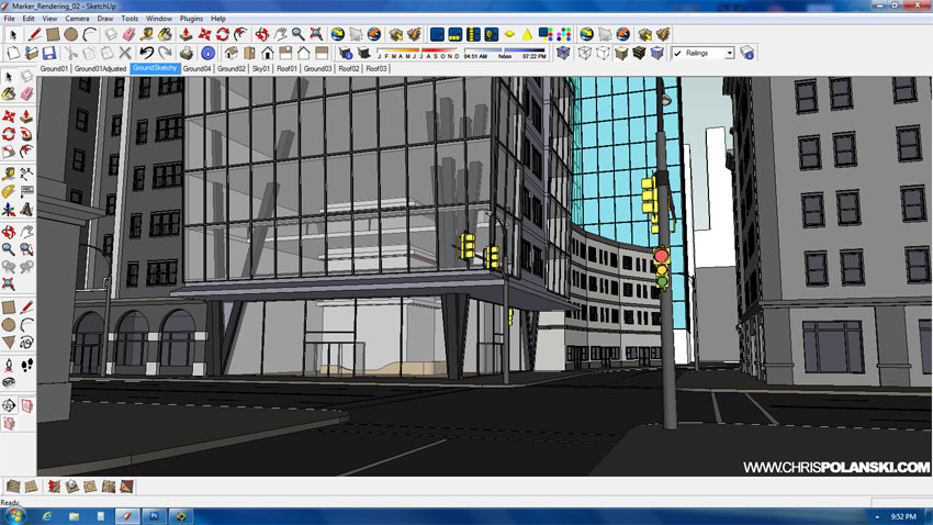
1. Below is a view of the model and selected perspective directly in SketchUp. Because this technique requires a few image exports directly from SketchUp, I recommend creating a scene to make sure your view does not change.
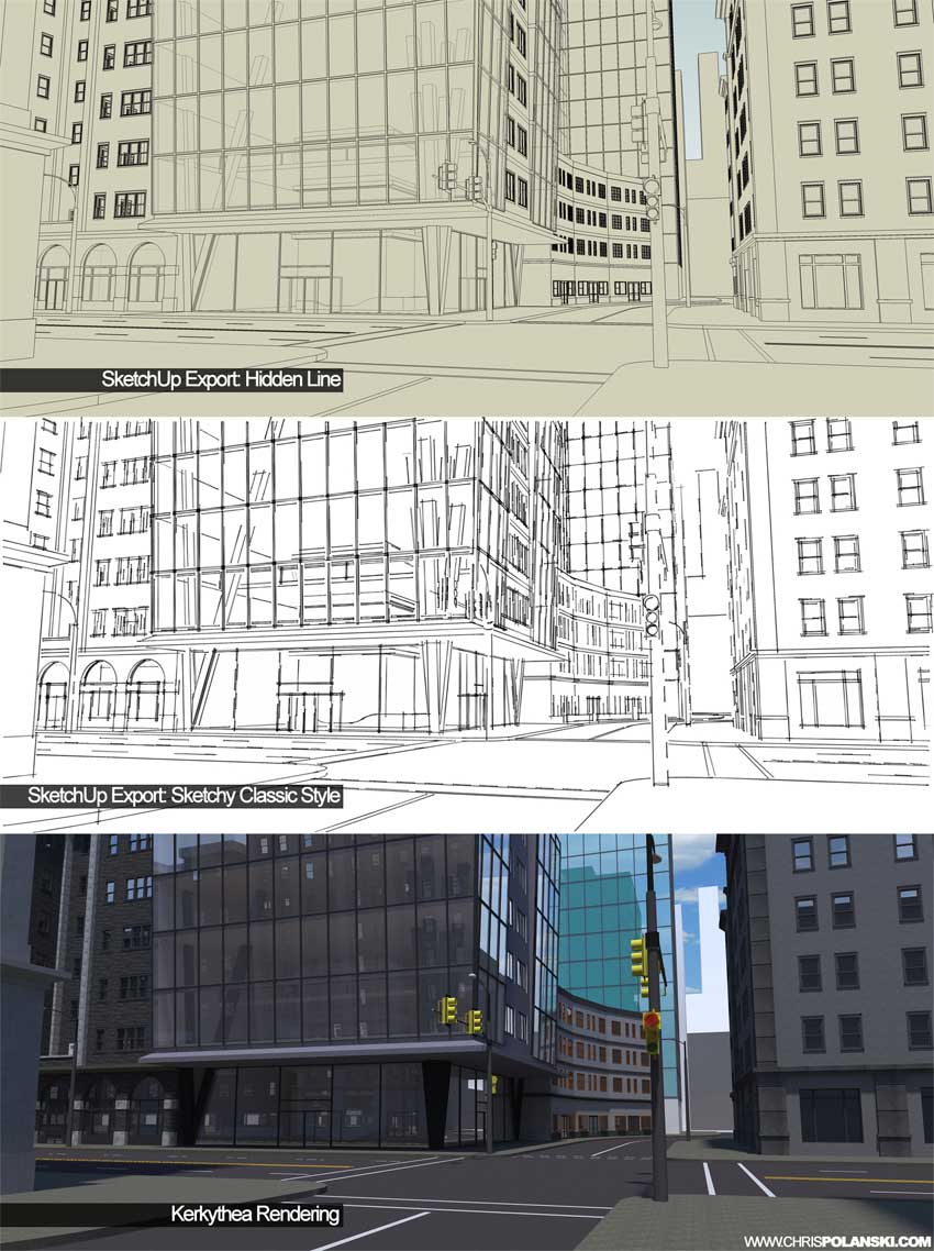
2. Three layers are required for the final image. First change the view to Hidden Line, turn off profiles and export the view. The second image should be a looser, sketchier view. Here I chose to use the “Classic SketchUp Jitter with Endpoints” Style, however others may better fit a different image. Third and finally is the colored rendering. I typically use Kerkythea as my program of choice for creating renders; however other rendering programs would do just fine. Just remember to maintain the exact perspective and image size so that everything will line up later in Photoshop. As mentioned before this image could also be replaced by another SketchUp export containing colors, textures and shadows if you prefer. Below are my three images:
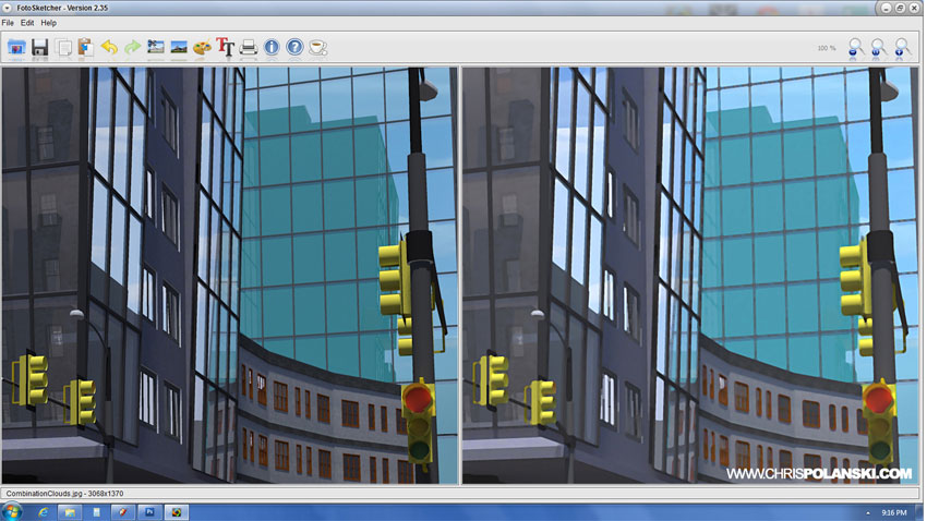
3. I’ll throw this in here although it is a completely optional step in the process. I like to use FotoSketcher to soften the rendering a little before bringing it into Photoshop. If you’re not familiar with the program it is freely available software that applied filters to images. Here I used the “Painting 3” drawing style to slightly blend like colors and blur the edges. The results are subtle but noticeable in the side-by-side comparison below.
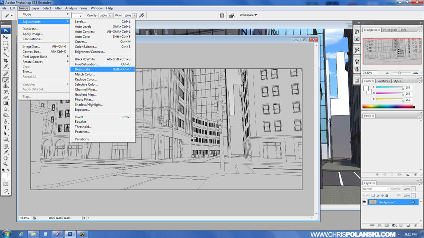
4. Now enter Photoshop and open the rendering first – this will serve as the base image. Next open the “hidden line” export. Desaturate the image and adjust the levels so that the image is black lines on a white background. Place the image on top of the rendering, set the layer mode to “multiply” and turn down the opacity to about 50%. Next open the “sketchy” image and place it on top. Again set the layer mode to multiply but keep the opacity a little higher at about 70%. All three images should line up perfectly so long as your view never changed.
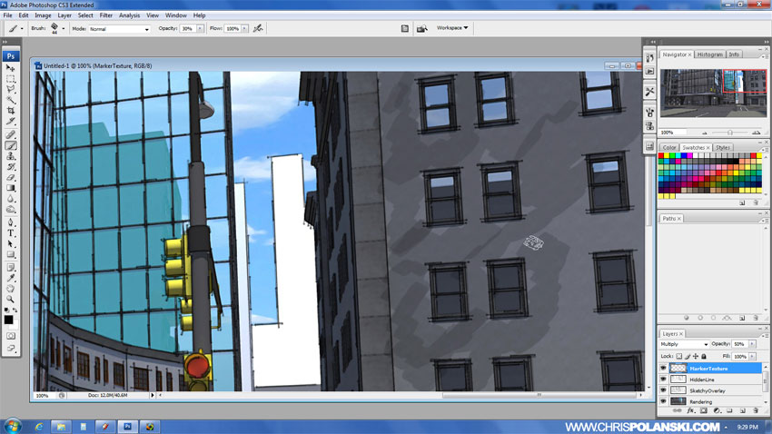
5. Next comes the marker texture overlay. Create a new layer, set it to “multiply” turn down the opacity to about 30%. Select one of the “chalk” brushes and turn down the opacity of the brush to about 30% and pixels too about 44.
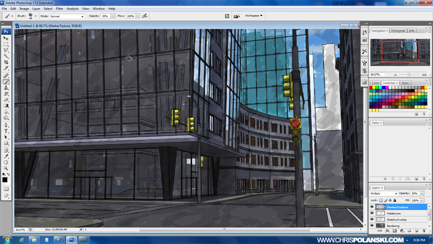
6. Select black or a dark gray from the color swatches and simply begin painting on the texture. Try to maintain a fairly consistent stroke direction and be as loose or careful as you wish when it comes to staying within the lines. The more you click and release the mouse, the more color variation and marker strokes will appear.
7. Below is a view after the texture has been applied to the entire image. By adjusting the opacity of the marker texture layer up and down you can make the effect more or less prominent. Adjusting the levels of the rendering layer will also lighten or darken the image.
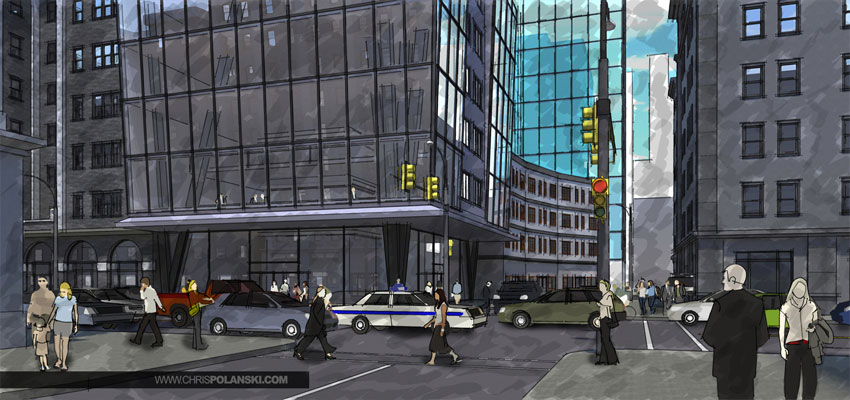
8. Below is the final image with people and cars added into the scene to give it a little life. I also adjusted the perspective in Photoshop so that all of the vertical lines are parallel. I kept the marker texture layer dark to emphasize the effect but would generally lighten it up a bit. Total working time, including the Kerkythea rendering, was less than an hour.
I hope you have enjoyed this tutorial and gained new ideas and concepts from it.
Christopher
You can see more of Christopher Polanski’s creative work and tutorials found here on his website.





excellent- very impressive and I hope to be able to do something even a little bit similar using your tutorial!!
[…] Christopher Polanski […]
Super nice
Thanks for the tutorial, love the marker look. Just used it on a project.
I like it a lot!