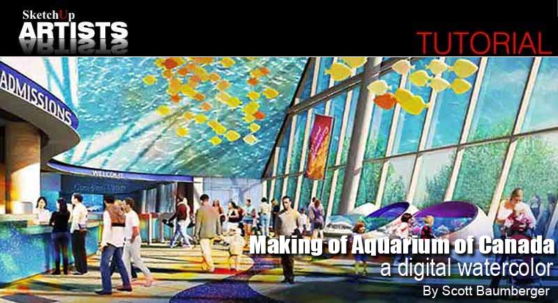
Making of Aquarium of Canada – a digital watercolor

By Scott Baumberger
Scott Baumberger has been offering a high quality professional service to architects, designers and developers for many years. He uses a digital process to produce imagery that ranges in technique from photo-realistic to simulated watercolor effects. His illustrations have been featured in numerous industry professional publications and Scott has also won numerous awards for his work. In this step by step guide Scott shows us his work-flow in producing a digital watercolor. Software used includes SketchUp, Shaderlight and Photoshop.
This rendering is the main entrance to a large aquarium in downtown Toronto, right next to the CN Tower. We had done several night time studies of the space and for this view we wanted to show how it would feel during the day time.
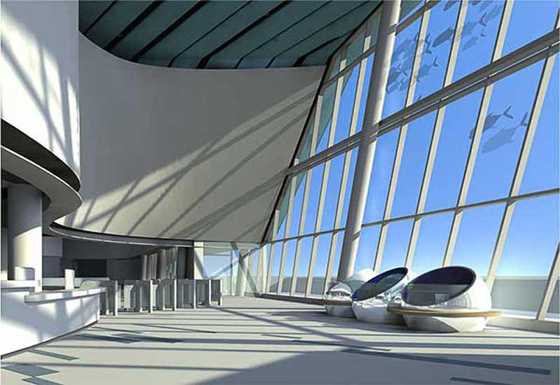
1. Given a SketchUp model from the client, the image below is a raw-color only export with the final viewpoint. I can use this image as-is for setting up most of the selection sets that I will need later. Right now it is pretty sterile – the client is looking for a warm image, so there is a lot of work to do!
2. With the viewpoint locked in, I look at different times of the day to get an interesting shadow play. For this project, I used the Shaderlight plug-in for rendering. The materials came through pretty well, although I had to turn off the glass completely to get the effect I wanted. The fish pattern at the upper right is actually in the glass so I left them turned on, but there are a couple of spots where they are floating on top of the mullions. There are also a lot of rendering artifacts that will need to be cleaned up – but its a good start. The ray-traced reflections in the sphere exhibits in the lower right are especially nice. I sent this image to the client for initial approval – once approved I am off to the races!
3. The first thing to do is clean up some of the artifacts that I mentioned, and add some new detail at the desk – all painted within Photoshop. Much faster than going into the model and trying to fix it there. I also adjusted the exposure in the far right exhibit to get some of that detail back.
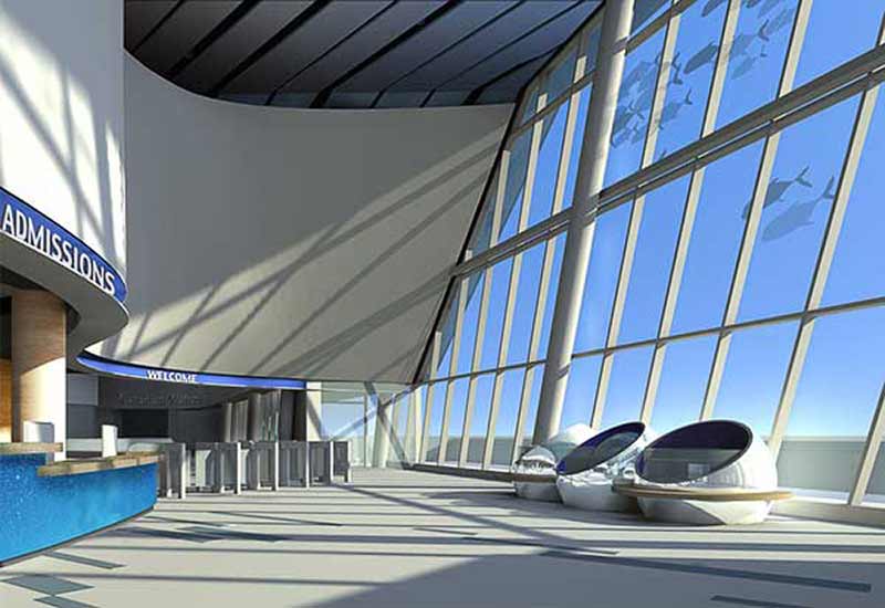
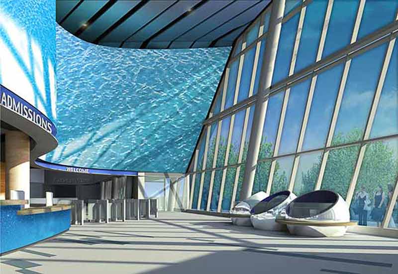
4. Next I attack some textures at the desk. Standard wood materials are applied via the Overlay blending mode, scaled, distorted and warped to match the perspective. It is worth the effort as I can change the strength of the material as well as make various hue, saturation and levels adjustments to the texture right up to the end. The water bubbles on the desk are built up in a similar manner using “non-destructive” blending modes to keep the original render from being covered up. Signage above is added as Text with a Layer Style applied to create the thickness. The “Canadian Waters” sign in the far exhibit uses another Layer Style to get a glossy effect. I have also cooled the ceiling and cleaned it up.
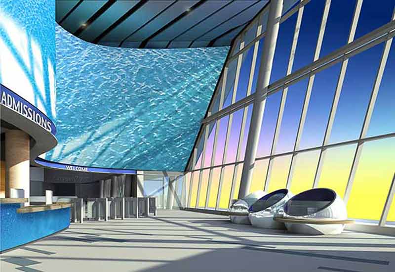
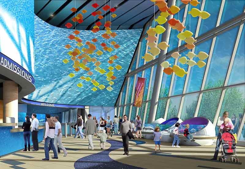
5. The large wall above the desk and entrance is a theatrical screen for projecting images. During the day it is designed to be a backdrop, with stock footage of water and caustics patterns. The intent is for these images to have a tropical quality with cyans and turquoise colors throughout. Because of the curve in perspective, I broke up the screen into the foreground and background segments. As with the wood textures, I use Multiply, Overlay and Color Dodge blending modes to maintain the shadow pattern from the rendering. I also added a blue glow to the ceiling panels and dropped in a couple of can lights.
6. Now it is time to move on to the sky. I tend to work from the back to the front. At this point it is pretty garish, but I know I will be adding trees and the glass plane itself on top of the sky group and that will tame it quite a bit. The sky wash is created in a similar fashion to a watercolor “wet in wet” technique. I start with a gradient from deep blue to a canary yellow. Then I drop in some green and purple colors and use the Smudge tool to push the color around until it feels right. In general I try to have cooler colors in the distance to suggest atmospheric perspective. Using the Smudge tool creates a more painterly effect than just sticking to gradients alone.
7. With the trees and clouds added, the sky is feeling much better. Still, there is a little bit of the purple and green showing through. Next I will tackle the large glass surface at the right.
8. Still working from back to front I added a simple glass rail and a few people outside. Then with the glass area selection I fill in a flat blue color for the glass surface itself. A custom Layer Style is added to simulate the glass thickness and also a hint at a slight “ambient occlusion” that would occur at the corner of the glass panel and the mullion. The sky wash has become pretty subtle by now.
9. Reflections can really help the glass come alive. The mullions are painted in via flat selections on a new layer set to a Soft Light blending mode. Verticals are white and the undersides of the horizontal mullions are nearly black. The background water image is copied and transformed to create its reflection. This time Normal blending mode, but at 50% opacity, does the trick. By setting the mullion reflections on top of the screen reflection in the layer group I do not need to worry about additional layer masking.
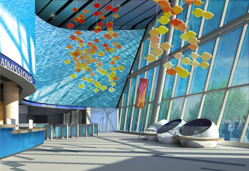
10. Glass panels are painted in via the same technique at the back wall and at the entrance stalls. Next the fish mobile is added, leaving the material somewhat abstracted. They are meant to be translucent with some internal light scattering to help them glow day and night. To create them in Photoshop, I set up a custom brush with the shape that was supplied by the client. Set to scatter, it created the random pattern desired. It took a couple of tries to get right, but went very quickly. Reds, oranges and yellows were chosen to compliment the predominately blue scene. Once approved, I made a copy of the close mobile for its reflection. It does not need to be physically accurate, but it is important that it is there.
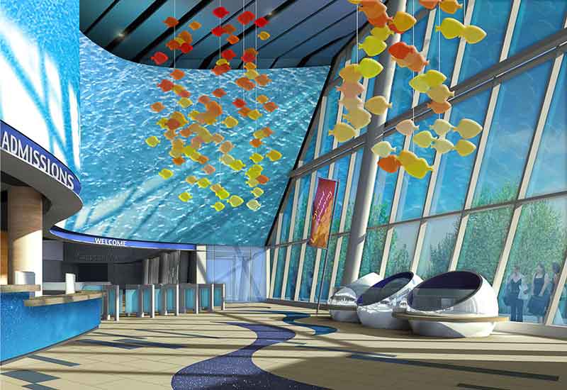
11. At this point we get a slight revision to the floor pattern design. Blue and purple granite swirls are to help guide visitors to the entrance. From a sketch, these swirls were painted in perspective and quickly approved. With this out of the way I added a granite texture (non-destructively) with a lot of white flecks to help it “pop”. A tiny bit of ambient occlusion is added as well to help it set into the rest of the scene. The joint pattern is brought in via a lines-only export from SketchUp set to Multiply blending mode and then masked to the floor area.
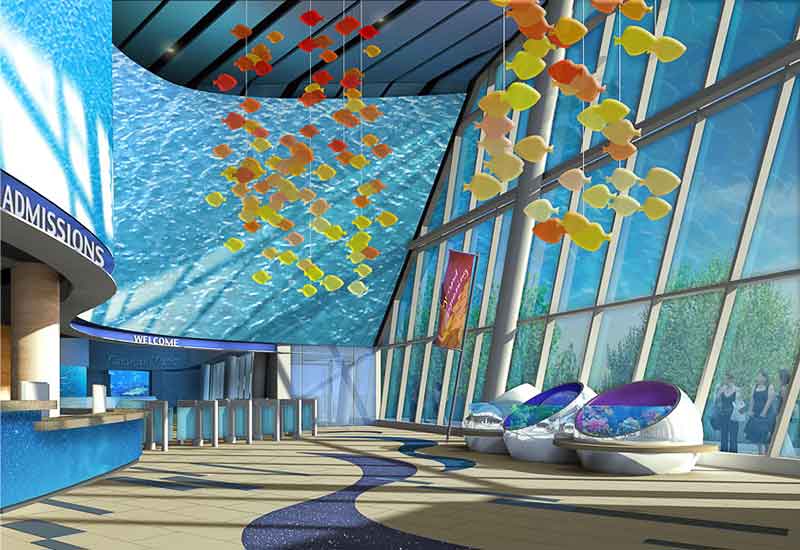
12. Now the fun part! With some guidance (and some reference photos) from the client, I build up the exhibits. The three spheres at the right are meant to be hands-on for visitors to explore while waiting for the gates, etc. As with the rest of the texturing, the images, glows and washes are all added via non-destructive blending modes to keep the glassy look from the original render. Additional color is added to the inside of each sphere to differentiate. Distant exhibits behind the gate are developed with the same technique. A deep blue glow is added in the far exhibit for atmosphere.
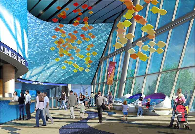
13. Next the people are added to the scene. Careful attention is given to there placement. On the one hand you want a lot of people to sell it as an active space, but you also do not want to cover up important design features. With this in mind, I set up “view corridors” so that the entrance and the far exhibits are still visible. Children are postioned at the sphere exhibits to reinforce their “hands-on” quality.
14. People shadows and reflections are added, as well as a host behind the ticket desk. Reflections are kept simple, and emphasized in areas of shadows.
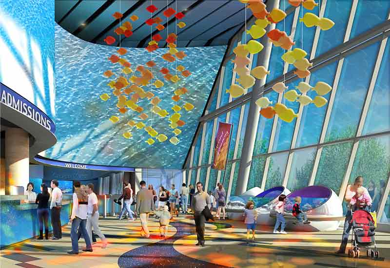
15. Getting close now! The next effect was to add a dense color pattern on the floor to indicate overhead lighting passing throught the mobile. Colors are cast on the people and desk as well. I also added a copy of the left mobile in Color blending mode to indicate secondary reflections from the mobile on to the screen in the background. With this effect, I could get more warm colors in areas that were feeling too cool.
16. Now we are into the final adjustments. I had several gradient washes to darken the edges of the image and provide additional color balance. Texturing is added via the Overlay blending mode. I like to use a Pattern Adjustment Layer for this effect so I can tweak the scale, rotation, etc. without any loss of quality. With a Levels Adjustment Layer, I added more contrast and “punch” to the image.
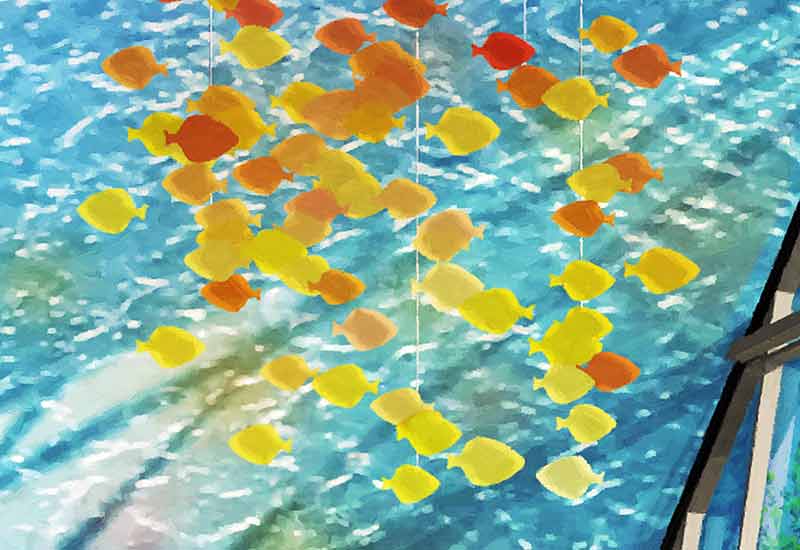
17. I have been working on a new technique incorporating the Art History Brush tool. Once I am happy with the image overall, I make a flattened copy of all layers on top of the stack (the keyboard shortcut for this command is Shift-Ctrl-Alt-E ). Using the Art History brush I zoom into 100% and scribble out any artifacts, any “jaggies”, really anything that still looks “computer-ey”. After a few minutes, it usually looks a lot better at full size. If the effect is too strong I can mask it out or dial down the whole layer’s opacity. This step really helps the image feel like a painting. It is hard to see the effect at this scale, so I have included a couple of blowups of the image at 100% (see below).
Thanks for reading this “‘making of” and I hope you have learned a few more tricks to add to your work-flow.
Scott














very nice one.
Great Rendering Scott, how many hours did you spend this rendering?