
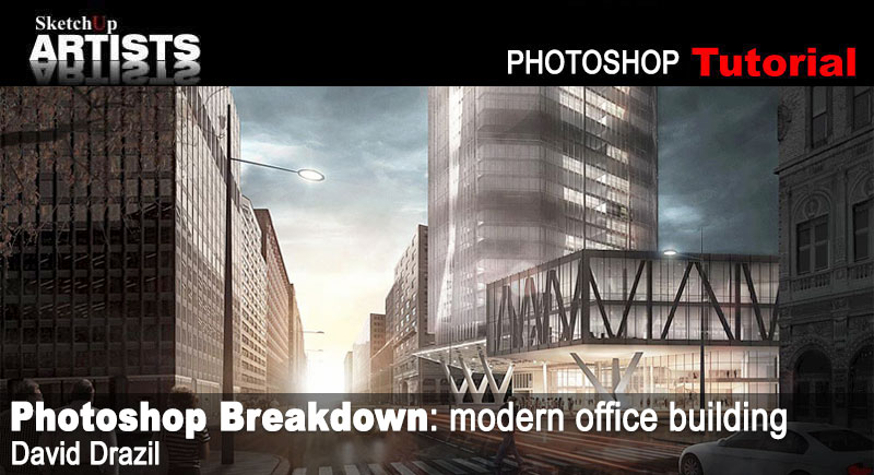
Photoshop Breakdown: modern office building
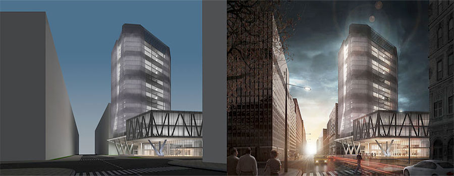
David Drazil is an architecture student from the Czech Republic, currently finishing his studies in Denmark. The final image was originally an entry for the 3D challenge held by Sketchup Texture Club. The goal was to create the best possible visualization depicting the building, designed and modeled in SketchUp by Quốc Hữu Trần.
The general brief was:
“Modern Office Building is a project that perfectly interprets the architectural trends of recent years. Create a digital image by using the 3D model provided. The images can be of any scene, either: natural, industrial, urban, ecological realistic or imaginary. Your job is to create the perfect environment, highlighting the best features of this modern office building. You can replace all the textures as you like, but do not change the appearance and the architectural structure of the project. You can add any personal detail such as vegetation, background, people, thus creating the atmosphere you want, in order to give a distinguishing mark of your own”.
The SketchUp model was the only thing provided for the competition. David says ” I was attracted by the theme and its freedom”. In this great tutorial David guides you through his detailed workflow.
Project
Introduction
This breakdown shows my approach to architectural visualization, which basically consists of making quite a quick and basic render and then doing all the rest in Photoshop as a part of the post-process. Therefore I am not going into any technical render parameters here, but I´d rather show some general thoughts behind the image and share a couple of matte-painting tips and tricks which I have learned and used so far. Let´s get into it..!
Workflow
My workflow can be generally divided into 5 steps as seen in the picture below [01]. I think the research phase plays an important role at the beginning of the process as it creates guidelines for the rest. This time I was inspired by professionals in arch-viz industry, who already made some imagery presenting tower buildings or skyscrapers. Based upon this I created a mood-board with reference images, showing the mood, atmosphere and possibly a bit more concrete environment which I want to locate my building into. A very helpful element can be a colour palette, which may come up as the result of the previous two phases.
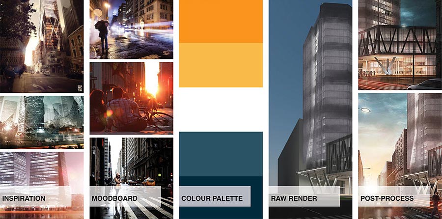
[1] Moodboard
[2] Hand-sketch
Research Phase
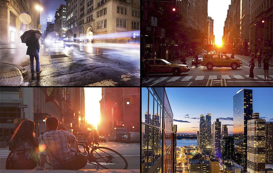
Inspiration is pretty much everywhere we look and I believe that a great sources for arch-viz lay in photography, movies and video games. You can find all important aspects there, such as nice composition, strong storytelling, seductive atmosphere, or interesting colour schemes. Simply all those things you should be aware of when making pictures and which should be more or less clear before you even hit the render button.
In this case I was inspired a lot by awesome work of Nicholas Richelet and his conceptual AP002T Tower. I created boards on my Pinterest account with similar pictures to analyse what makes them so good [03].
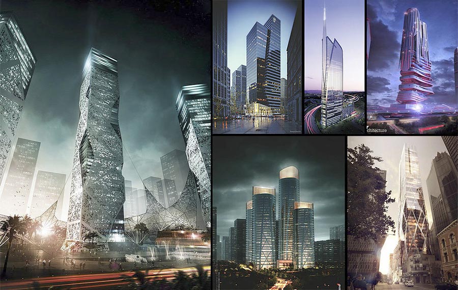
[3] Tower board
[4] Atmospheric mood-board
As a final step of the research I created a colour palette based on the mood-board. I chose quite saturated complementary colours of orange and blue, which I hoped to create a decent contrast between warm and cool areas of the image. For such colour palettes you can use paletton.com or Adobe Kuler (on the website or as a tool integrated in Photoshop).
Composition
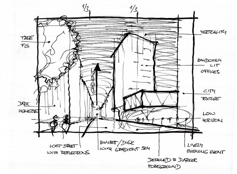
A composition of an image is a crucial element and it needs to be set at the beginning. In my initial hand-sketch I already suggested a rule of thirds with very low horizon, which I kept in mind during the process. You can choose any composition you like, such as golden ratio, golden spiral, triangular composition, symmetric one or any other you wish. But in the end, it does not need to be strictly followed. It should just help to compose the main volumes in a pleasing way, together with suggesting the focal points and eye-guidance of the image. In order to create a depth in the image, it is a good idea to define several depth planes, typically foreground, middleground and background. The depth of an image is also connected to atmospheric perspective, meaning that colours in the foreground may be darker and more saturated and they fade out towards the background and horizon. In this way, you can also create a nice framing with you foreground plane. I described my composition in the following images.
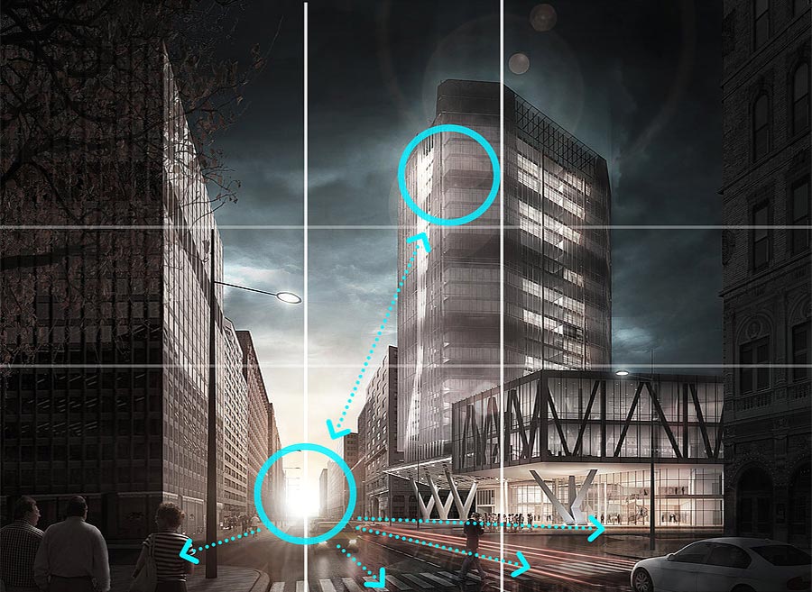
[5] Rule of thirds with very low horizon
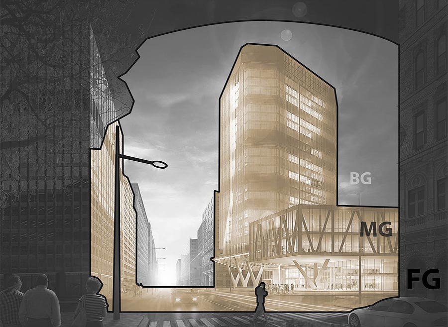
[6] Foreground, middle-ground and background
Render
The render was created with the V-Ray for SketchUp using basic settings. I built a couple of surrounding volumes to the main building and then I only added several V-Ray rectangular lights and spotlights. For composing the view I used advanced camera settings with 2-point perspective. Cars and street lamps were rendered separately for easier manipulation in post-process. The width of the final render was set to 4000 px and exported into several different passes.
Post-process
Let´s start with an overview of the Layer structure. Since the image is very heavily post-processed, the number of Layers is really high, but I tried to keep it grouped and organized with a chronological order from bottom to top. The only visible group now is THE BASE, which contains all the render passes – the raw render masked out with alpha channel and a couple of other elements, such as GI and Lighting passes, for light adjustments. On top of that, there are several adjustment Layers and a CORRECTIONS group with minor render-repairs.
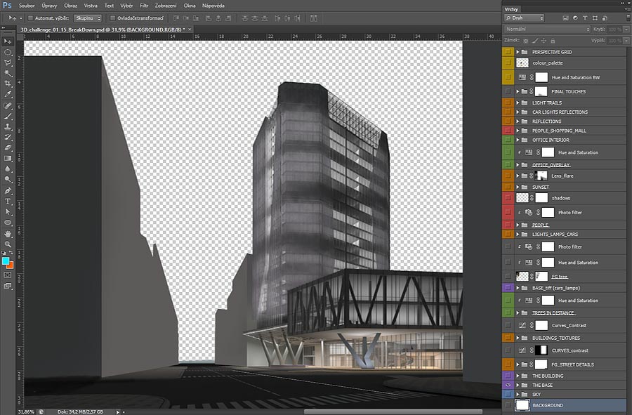
[7] Base Group
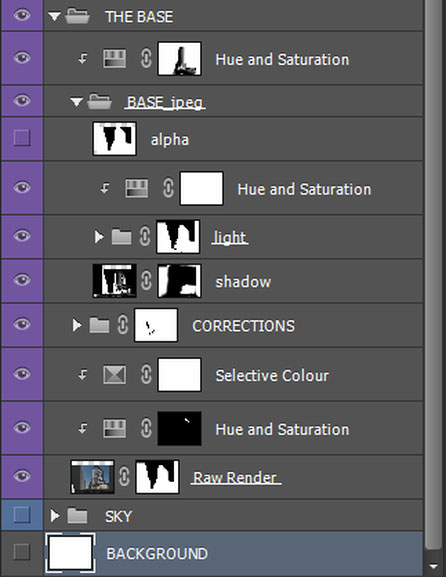
[8] Corrections Group
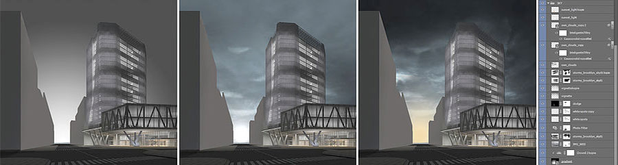
[9] Sky work
[10] More building adjustments
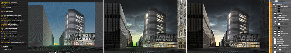
[11] Deform textures to match the perspective
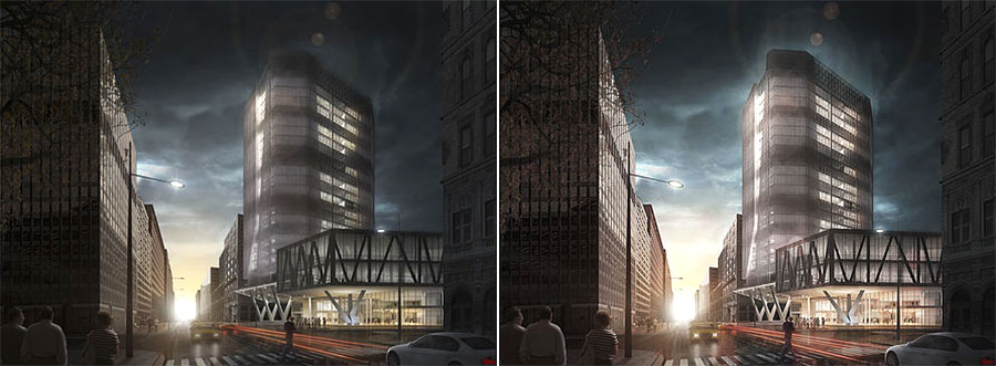
The next phase is about filling up the space and inserting more architectural entourage. Specifically, placing trees, people, rendered street lamps, cars and making it all blend into the image using Adjustment Layers and a bit of painting. The same strategy as with texturing the surroundings was applied also here.
The only exception may concern inserting people, which is a bit more tricky. I´d like to refer to a great tutorial made by Horoma about this topic, good tips and tricks within. I usually decrease the saturation of my inserted objects to fit in the colour context. I also keep a Black and White Adjustment Layer at the top of the Layer panel so I can check and adjust the luminosity of the objects to blend them smoothly in the picture. Together with correction of the lighting with another Hue and Saturation Layer and possibly a unifying Photo Filter, you should be able make it perfect.
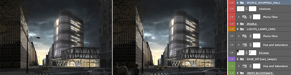
[12] Inserting more architectural entourage
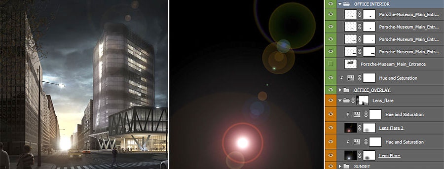
[13] Enhance sunset on horizon and add Lens effect flare
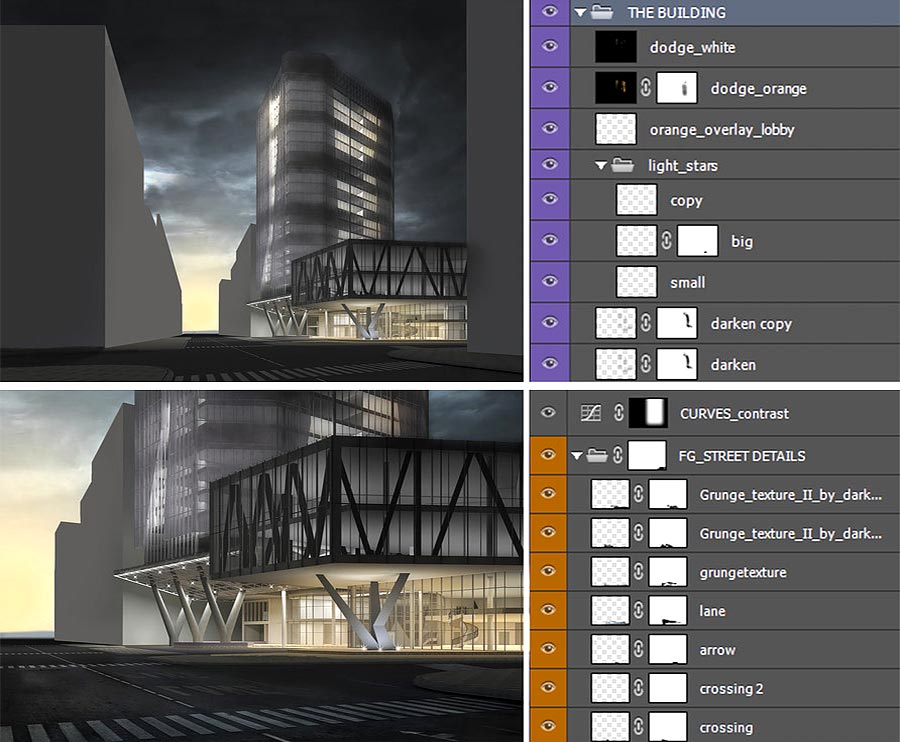
In this phase I also brought a bit more life into the volumes of the tower and the truss structure by overlaying some more reference images. It´s again this Layering principle, which works really well for enriching the image.
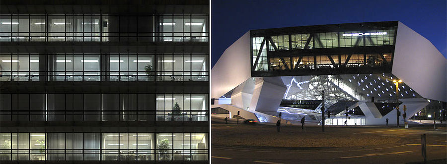
[14] Bring more life into volumes of the tower and truss structure
Very easy and yet powerful trick was to create a wet street illusion with reflections of the surroundings. I created the reflection Layer as a merged copy of all visible Layers (Ctrl+Shift+Alt+E) and flipped it vertically. Then I moved it down under the horizon so the building looked like it was mirrored on the water surface. Finally I set the blend mode to Soft Light and masked it out where inappropriate. Then I painted the reflections of car lights with soft brush and blurred it with the Gaussian Blur (Filter->Blur), the blend mode was kept at Normal, just with a lowered opacity.
The light trails were created as paths with the Pen Tool. Then, with the Pen Tool selected, right click on the canvas and choose to stroke path with the Brush Tool. The Brush Tool needs to be correctly predefined before this move (diameter, hardness, color). I also painted a yellow color overlay on top of it as a Clipping Mask, so it influences only the light trails. For a stronger effect I made several copies of the light trails, blurred with Gaussian Blur, and created reflections on the ground.
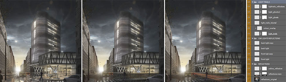
[15] Add reflections and light trails
[16] Tricks to make the image pop and add some crispness
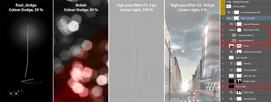
[17] Filters and blend modes
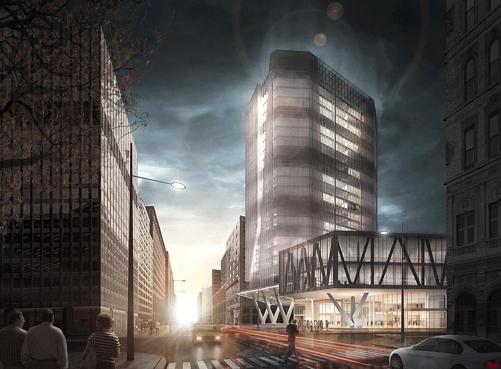
Final image
Final Thoughts
That´s it..! This was just one of many approaches to arch-viz. It can be tedious, but brings a lot of fun and freedom during the artistic process. All the links for the stuff I have referenced to can be found below, together with some interesting resources to explore and to learn from. I hope it was at least a bit helpful for some of you. And thanks a lot for reading, if you have made it this far!
Cheers
David Drazil
This article was originally made for www.learnArchViz.com
Resources to Explore
Pedro Fernandez:
http://www.arqui9learn.com/matte-painting-tutorial
http://www.arqui9learn.com/changing-lighting-and-skies-tutorial
Pixelflakes – Shipyard tutorial
https://www.youtube.com/watch?feature=player_embedded&v=bA0YvxBPdYo#!
Blender guru – Andrew Price:
http://www.blenderguru.com/tutorials/understanding-colors/#.VD-0hPl_t8E
http://www.blenderguru.com/tutorials/understanding-composition/#.VD-m-fl_uSp
Personal Links to the author:
LinkedIn: https://dk.linkedin.com/in/daviddrazil/en
Issuu Portfolio: https://issuu.com/david_drazil/docs/david_drazil_portfolio
Profile Builder 4

Artisan Organic Toolset

PlaceMaker Version 3
Skimp Pro Import Extension

BIM Bundle Special Offer!
SketchPlus Artist Bundle !
Bevel Tool
V-Ray 5 for SketchUp E-Book
Its such a good work.
Can you please send the sketchup file on my email.
sufyan.ahmad12@gmail.com
amazing.. so hard and dificult possible making 3d image with photoshop.
what version of photoshop ??