Tradigital Drawing – Using the Simple Composite Method

By Jim Leggitt
The following Tradigital Drawing was generated for academic purposes and does not represent any actual project. I built the SketchUp model from components found in the SketchUp 3D warehouse and from FormFonts. Many thanks to all individuals that may have been responsible for building the original SketchUp components that were assembled to make this model.
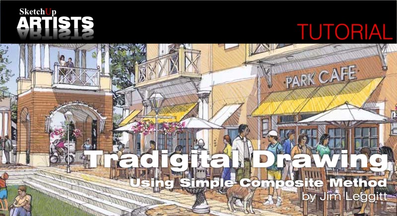
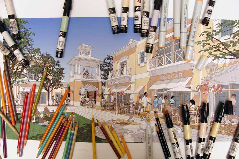
Step 1: Determine the model view. This 2-point eye-level perspective in the image above was carefully established with very specific sun angles, placement of components, sky color, 3D trees and people. Foreground trees (not in view) were positioned to create dappled leaf shadows on the steps and ground. Every component was shifted into an ideal location to support the multiple focal points in the view. The model scene was established with a 45mm focal length and a two-point perspective camera view. Bright clothing colors of the people components were all muted using the materials edit tool. I never accept the colors that are imported with components. I always add transparency to leaves and desaturate bright colors. Once the model scene was complete, I saved and then began the process of exporting different variations of the model.
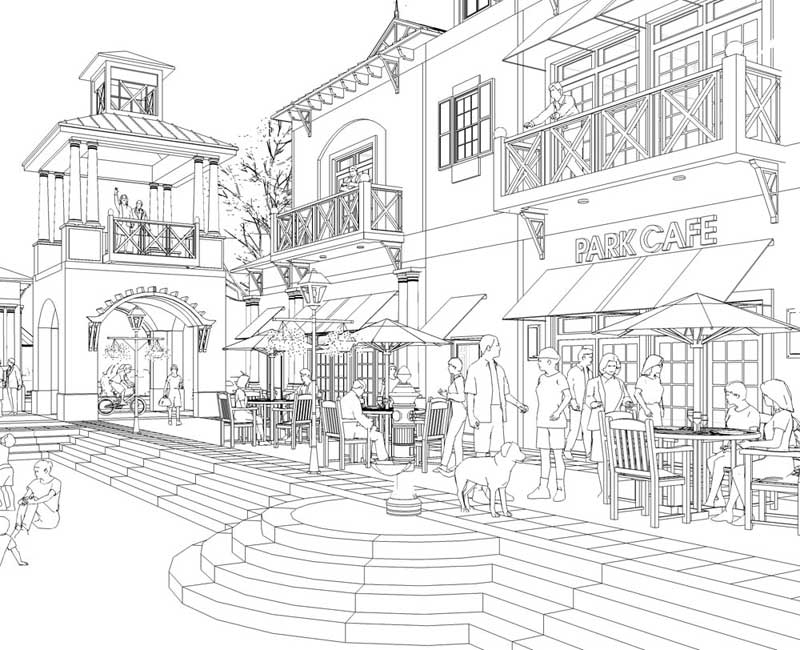
Step 2: Export a straight linework image. I turned off the sky and shadows and selected the hidden line mode in the style menu. The displayed edges have no profiles, extensions or other variations – just the basic linework. Export a TIFF image at 300dpi 12 inches wide. I often will lighten this image in Photoshop depending on the density of linework (too many lines together can get rather black and muddy).
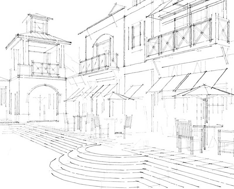
Step 3: Export a fineliner image. I opened up the styles menu and selected the fineliner option in sketchy edges. The rough overlapping linework had a casual hand drawn quality that I incorporate into the final composite image. Export a TIFF image at 300dpi 12 inches wide. The linework can also be lighten in Photoshop.
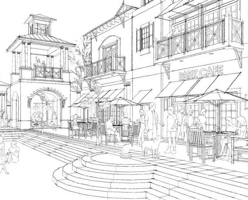
Step 4: Merge the two linework images. In Photoshop, I combined the straight line image and the fineliner image to create a blended look that has the accuracy of a wireframe but the character of a hand drawn line. When exporting different TIFF images, make sure your dpi and image size options are identical for easy compositing of the various images.
Step 5: Export a “no line” image. With shadows and sky turned on, I unchecked “display edges” in the styles menu and exported the edgeless image as a TIFF (remember to have identical dpi and size settings).
Step 6: Watercolor filter of the no line image. This step gives the view a “modeled” appearance – specifically adding a slight outline to the shadows. Save a TIFF copy of the original no line image and apply a Photoshop watercolor filter to the image. Adjust the settings to keep the image as light as possible. Now you are ready to combine all of the pieces together!
Step 7: Composite image. As it implies, merge together three images – the straight linework, the fineliner, and the watercolor filtered image in Photoshop. Save a flattened version of the composite image as a 300dpi TIFF image. You have one more step before printing – be patient, we are almost finished with the computer manipulation phase.
Step 8: Composite image desaturation. Because the image is going to be color printed and enhanced with color markers and colored pencils, it is important to remove some of the root color in the image. Save a new copy of the image and in Photoshop, reduce the amount of color saturation using the hue/saturation tool. With this image, I left the hue and lightness untouched but adjusted the saturation to a -25 on the sliding bar. Now the image was ready for color printing.
Step 9: Color plotting or printing. Depending on the image size, I either print the image in my studio on an Epson printer (C88 or Photo Stylus 2000P) or outsource the color plotting to a local design firm or reprographics company. It is very critical to have a high quality plotter and heavy weight coated bond paper. All printers and plotters have varying color results and it may be necessary to adjust your image lightness levels and color balance to get optimum results. An extra color plot can be a useful practice sheet for experimenting with color markers and pencils. Now it is time to add the hand drawing character to the image and change it from a computer generated perspective to an authentic work of art!
Step 10: Final hand drawing and color. This simple composite method is now 50% completed and it is time for some hand drawn fun. I have the following graphic products on hand for this final step in the visualization process – Chartpak AD markers, a small assortment of Copic markers, a set of Prismacolor pencils and a good electric pencil sharpener. There is a specific order in which I work and with good reason. Apply a base of color markers first, then add the linework and hatching using colored pencils. In this drawing, I added color markers to the building facade, awnings, clothing, tree leaves and pavement. I did not touch the sky as it was generated in SketchUp. Use only the lightest colored markers you can find and ALWAYS test your colors on an extra plot of the image. Once the marker coloring is complete, begin tracing edges of all objects and buildings with a sharpened black Prismacolor pencil. Squiggly lines and overlapping end points add to the informal character of the drawing and hide the computer’s straight linework. The toothy surface of matte finish bond paper accepts prismacolor pencils really well. Create hightlights on window mullions and roofs with a white Prismacolor pencil. Use different colors to enhance the stone paving, add texture to the building facades and grass and introduce character into the people. A light wash of yellow pencil on tree tops and building faces adds the illusion of sunlight. Scan the final colored image at 300dpi as a TIFF and compare the final drawing with an earlier computer generated image. The results will amaze you and impress clients!
For more information about Jim Leggitt, FAIA, visit his website: www.drawingshortcuts.com, twitter: http://twitter.com/jimleggitt or blog: http://jimleggitt.typepad.com. Jim is always looking for creative artists who are also exploring new hybrid drawing methods and would love hearing from you. He can be reached at jim@drawingshortcuts.com.
Watch out for future content and tutorials by Jim Leggitt here at SketchUpartists!!






You got something, the best of two worlds, computer generated sun angles and the feel of the hand it is wonderful
wilbur
enjoyed reading your article! Very simple yet effective method. Great Job. Thanks
Jim..
I’ve always enjoyed your work – but I think it’s too bad you have to go out of the digital realm and break out the markers and pencils. As soon as you do that – now sharing the ideas digitally becomes 100x more difficult – you have to re-scan…yadda yadda. I have to believe you could get pretty darned close to the hand-colored output using the tools in PhotoShop/ Illustrator/ etc My opinion is this – the PROJECT is the deliverable here, not the pictures of the project. (Unless of course you’re selling the pictures of the project then different story) – but if this is for a public review or a study for the project owner, etc… my vote is to stay digital.
How do you merge the first two images in Photoshop?